
BOEKS 06:
Post•Comics
circling∞corridoring
•boekpresentatie & opening•
donderdag 22.10.2020, 18:00
•tentoonstelling•
23.10.2020 - 18.02.2021
•finissage•
donderdag 18.02.2021, 20:00
publicatie
Post-Comics. Beyond Comics, Illustration
and The Graphic Novel
2020
Concept door Sébastien Conard
Design door Thomas Desmet en Emma Vanhille
Uitgegeven door het balanseer en KASK & Conservatorium
170 x 240 mm, 124 pagina’s, Engels, oplage: 250
Met teksten van Maheen Ahmed over Felipe Muhr, Benoît Crucifix over Ilan Manouach, Charlotte Pylyser over Olivier Deprez, Aarnoud Rommens over Tom Lambeens, Maria Clara Carneiro over Jochen Gerner, Jean-Charles Andrieu de Lévis over Benjamin Monti, Jan Op de Beeck over Sébastien Conard. Voorwoord door Jan Baetens en inleiding door Sébastien Conard.
ook op het Post*Comics programma
donderdag 22.10.2020
•18:00•
opening 1M3 door Ilan Manouach en Sébastien Conard
@ KASK, Inkomhal Pauli
+ opening Post-Comics / Post-Practices tentoonstelling door Chiara Becce, Suzy De Laere, Ieva Liba Ratniece & Adelina Rosseel (bachelorstudenten Grafische Vormgeving, Grafiek en Illustratie)
@ Kunstenbibliotheek, Cellarium
•19:00•
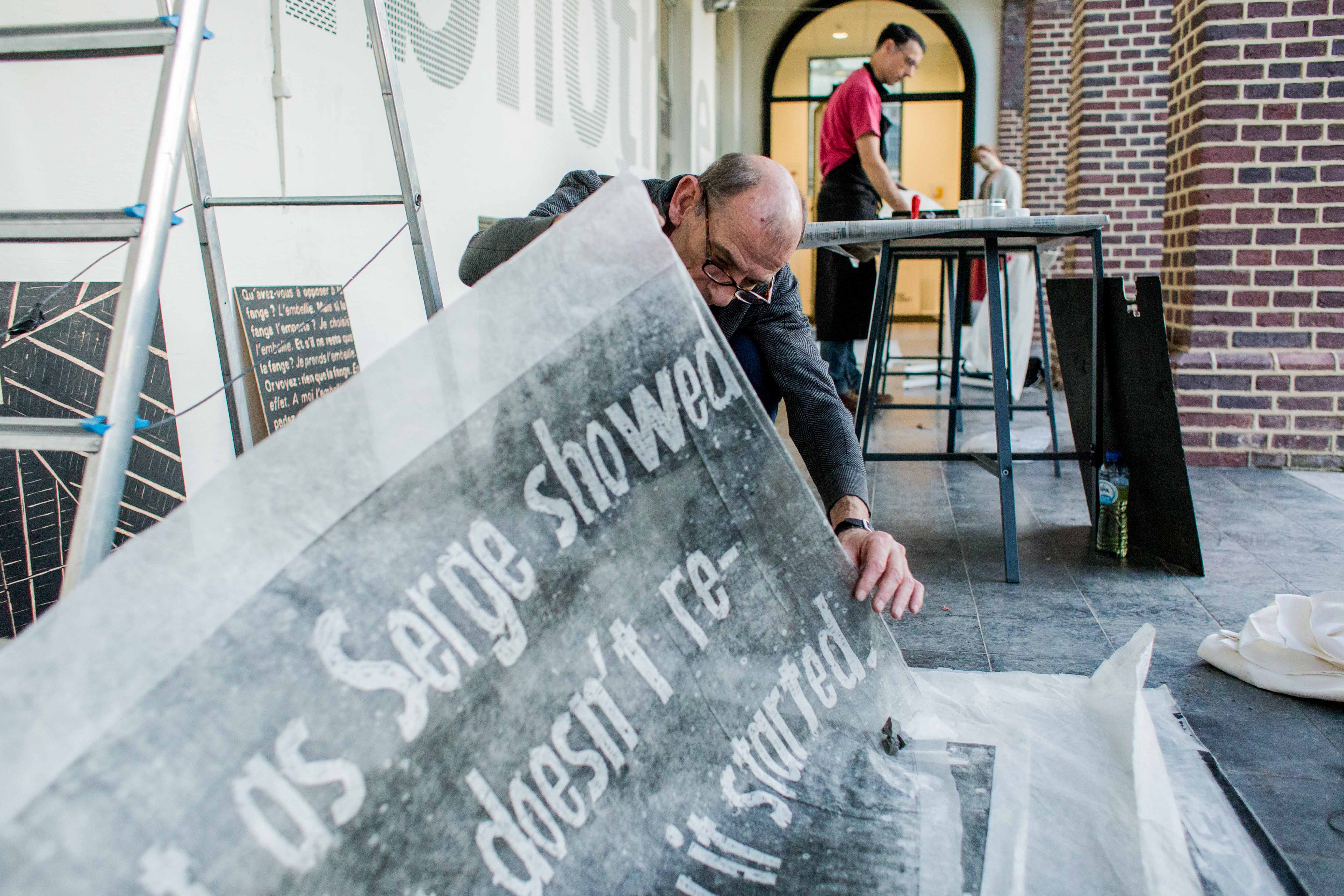
drukperformance door Olivier Deprez & Roby Comblain
@ BOEKS, Gaanderij
•20:00•
KASKlezing door Tom Lambeens
@ KASK, Cirque
Kan een kunstvorm worden wat hij niet is? Kan het stripverhaal of de graphic novel bijvoorbeeld, ontpoppen tot 'iets anders' in dit fluïde ‘post-medium’ tijdperk?**
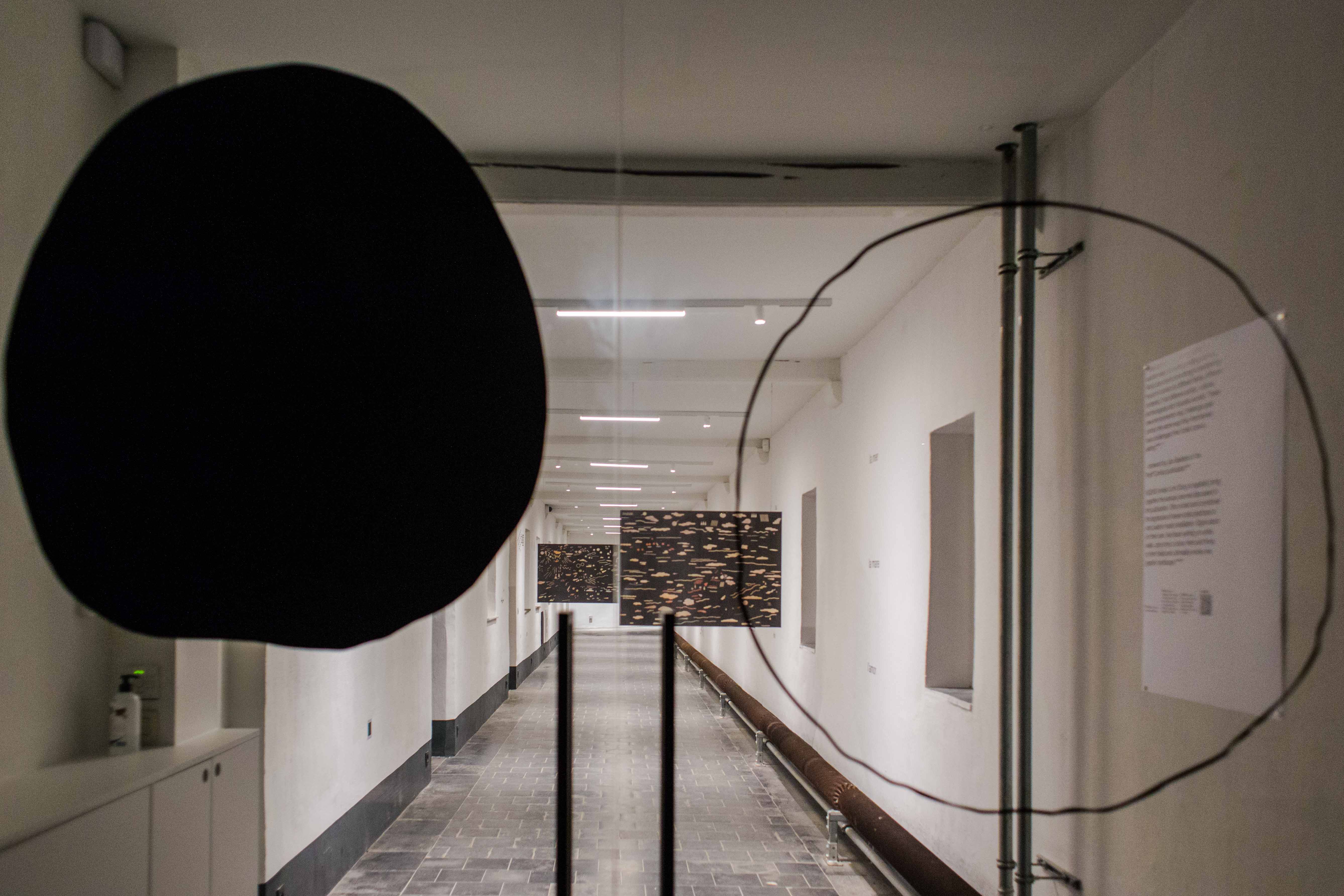
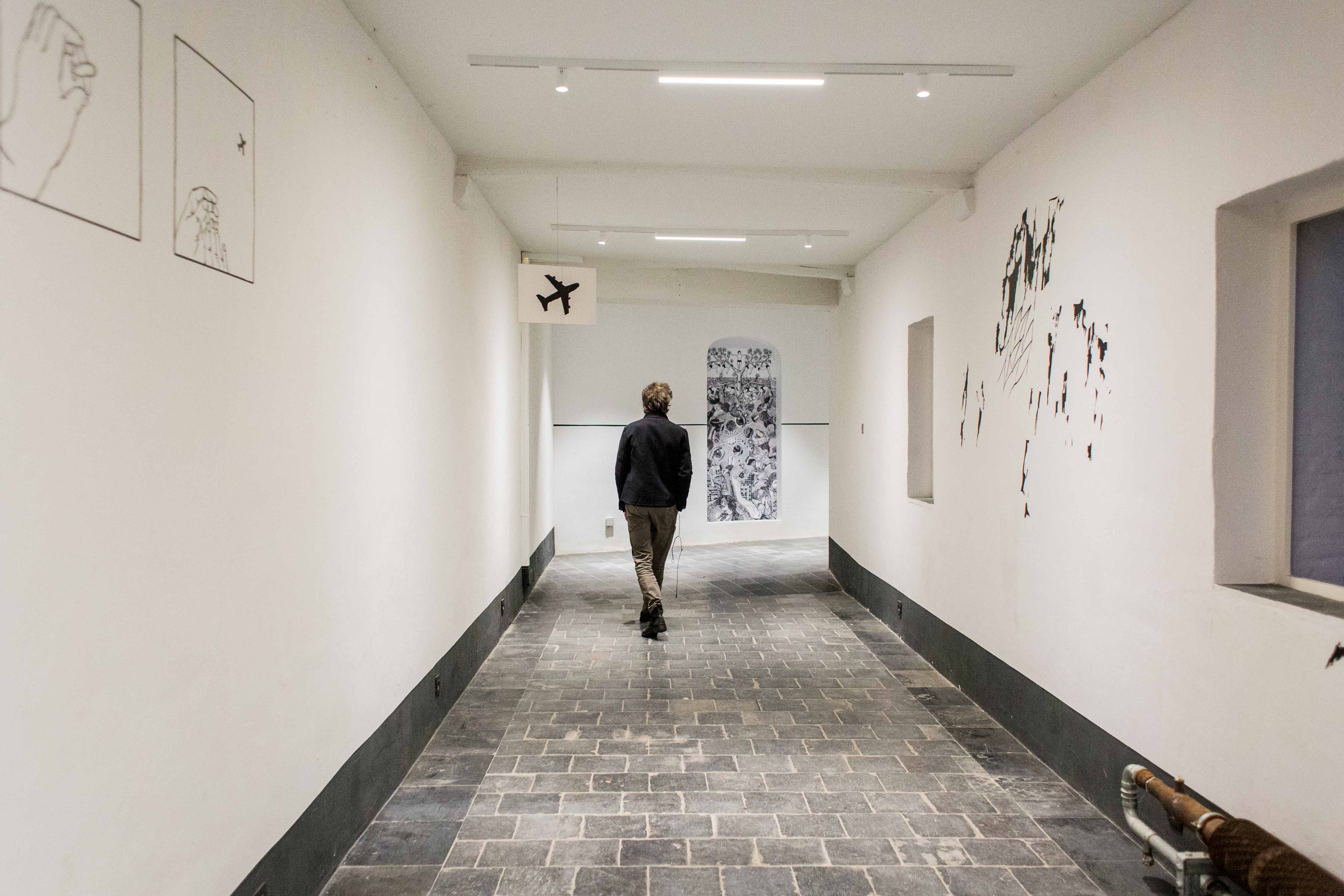
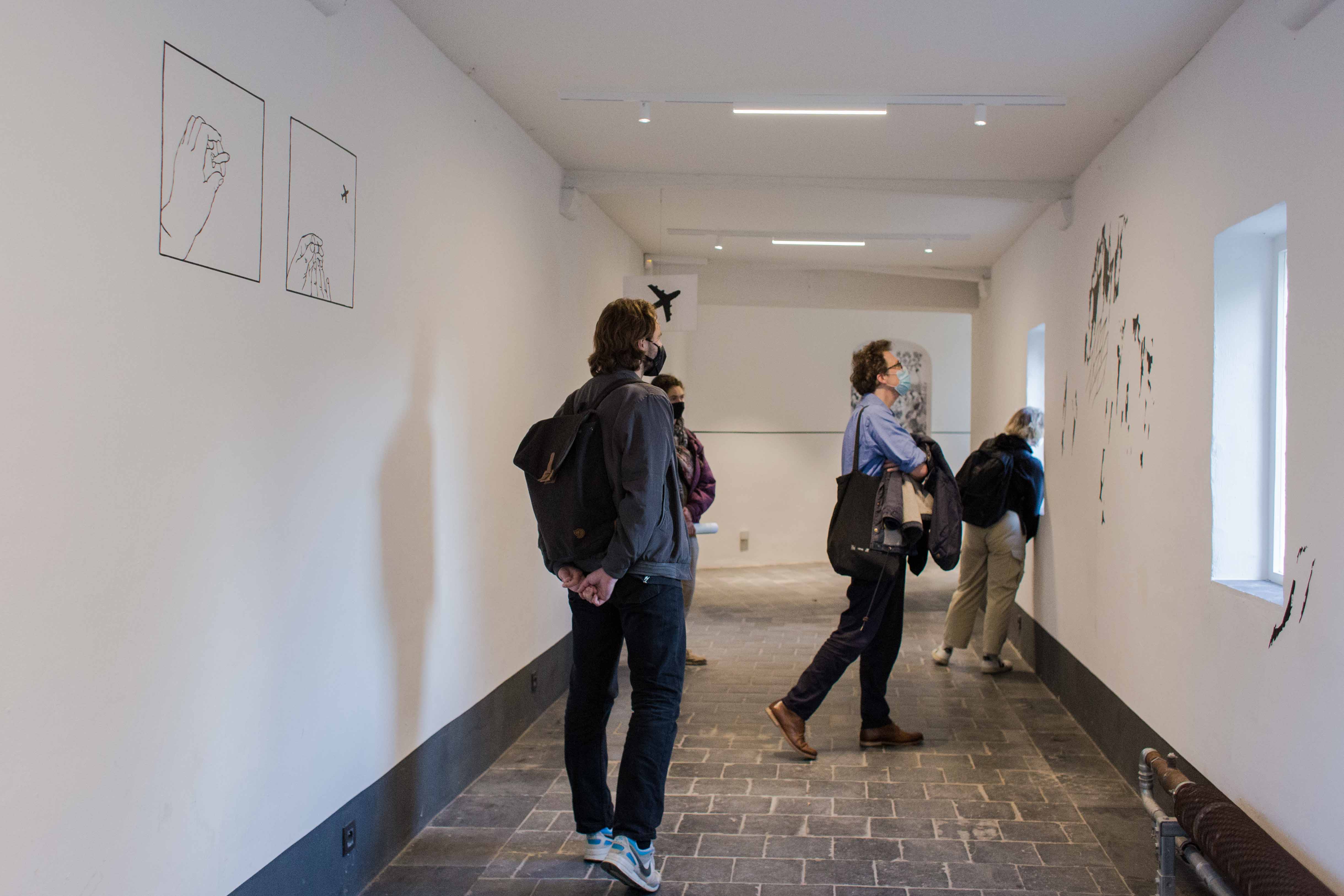
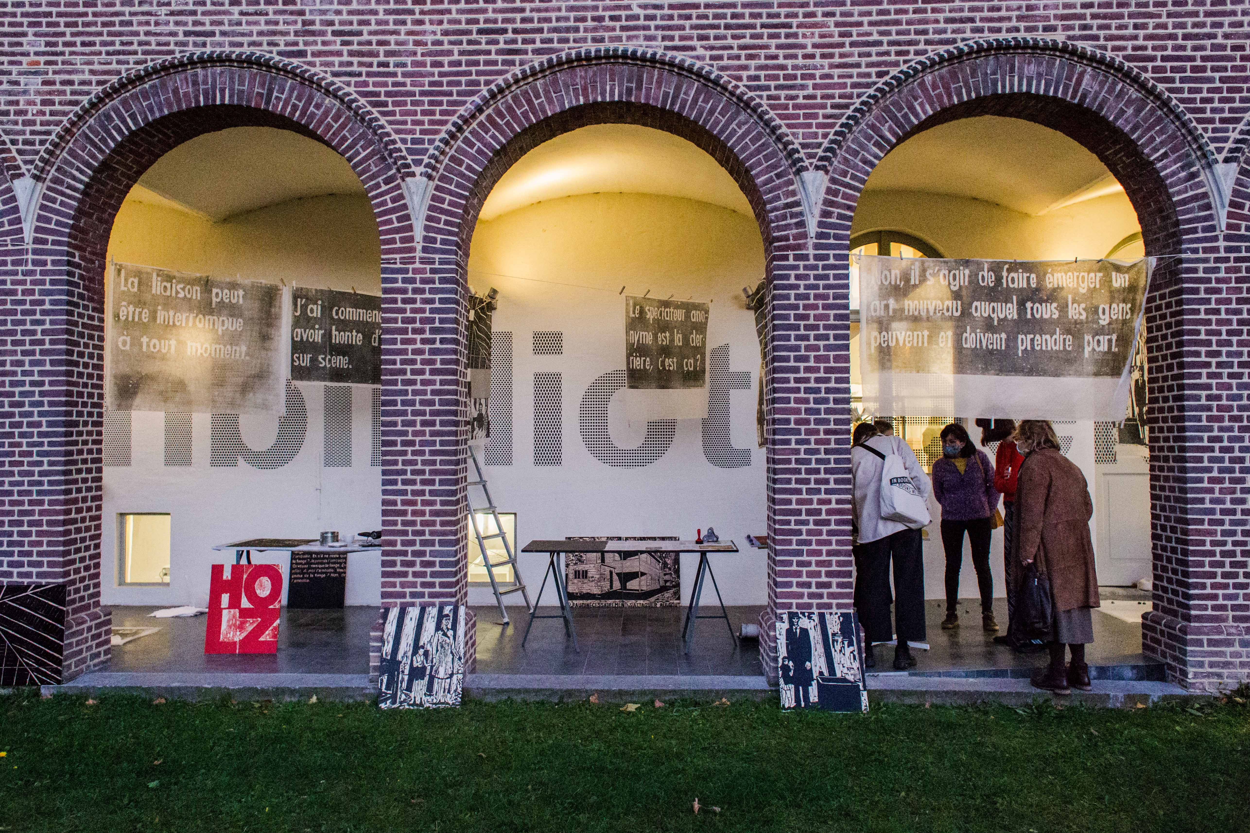
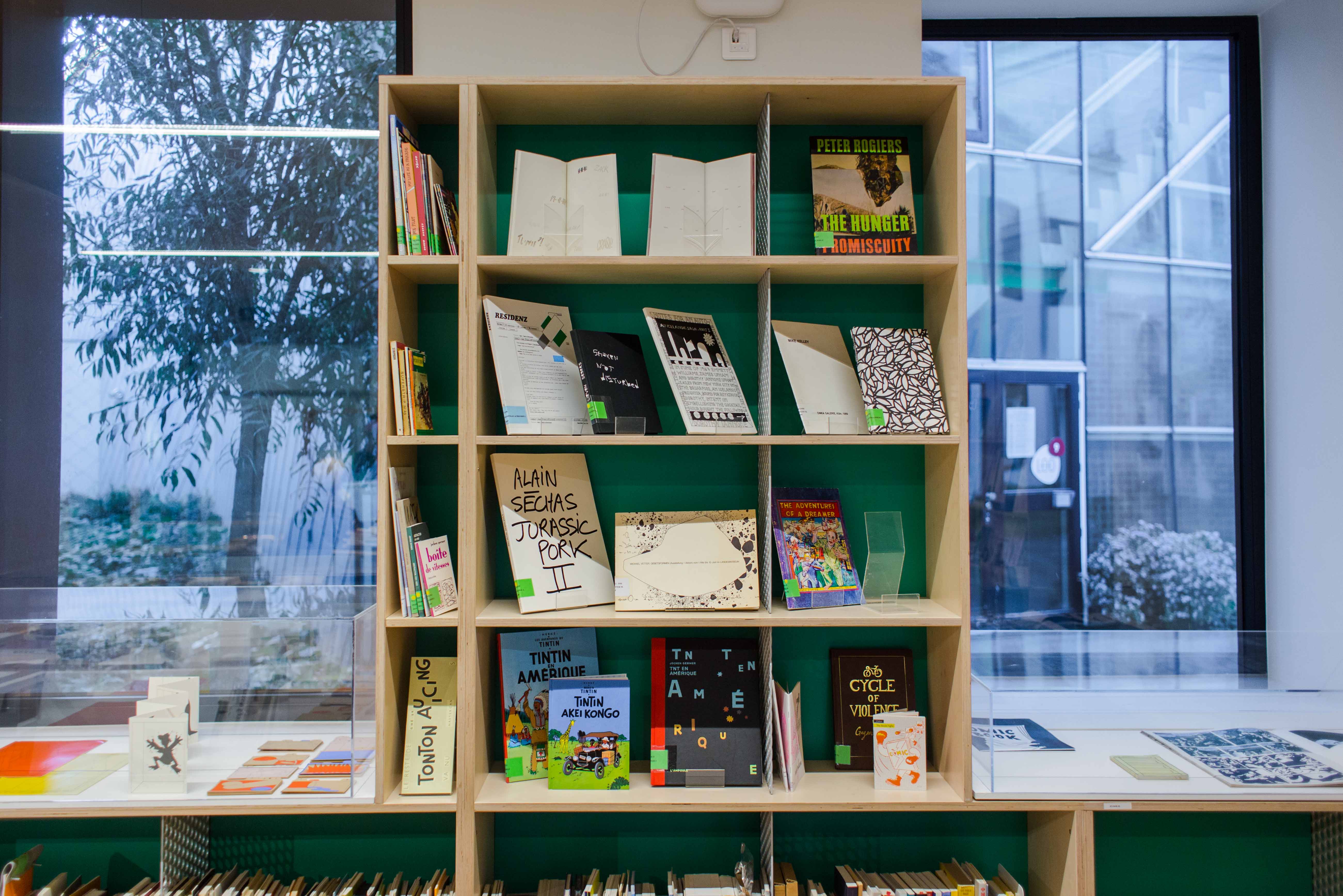
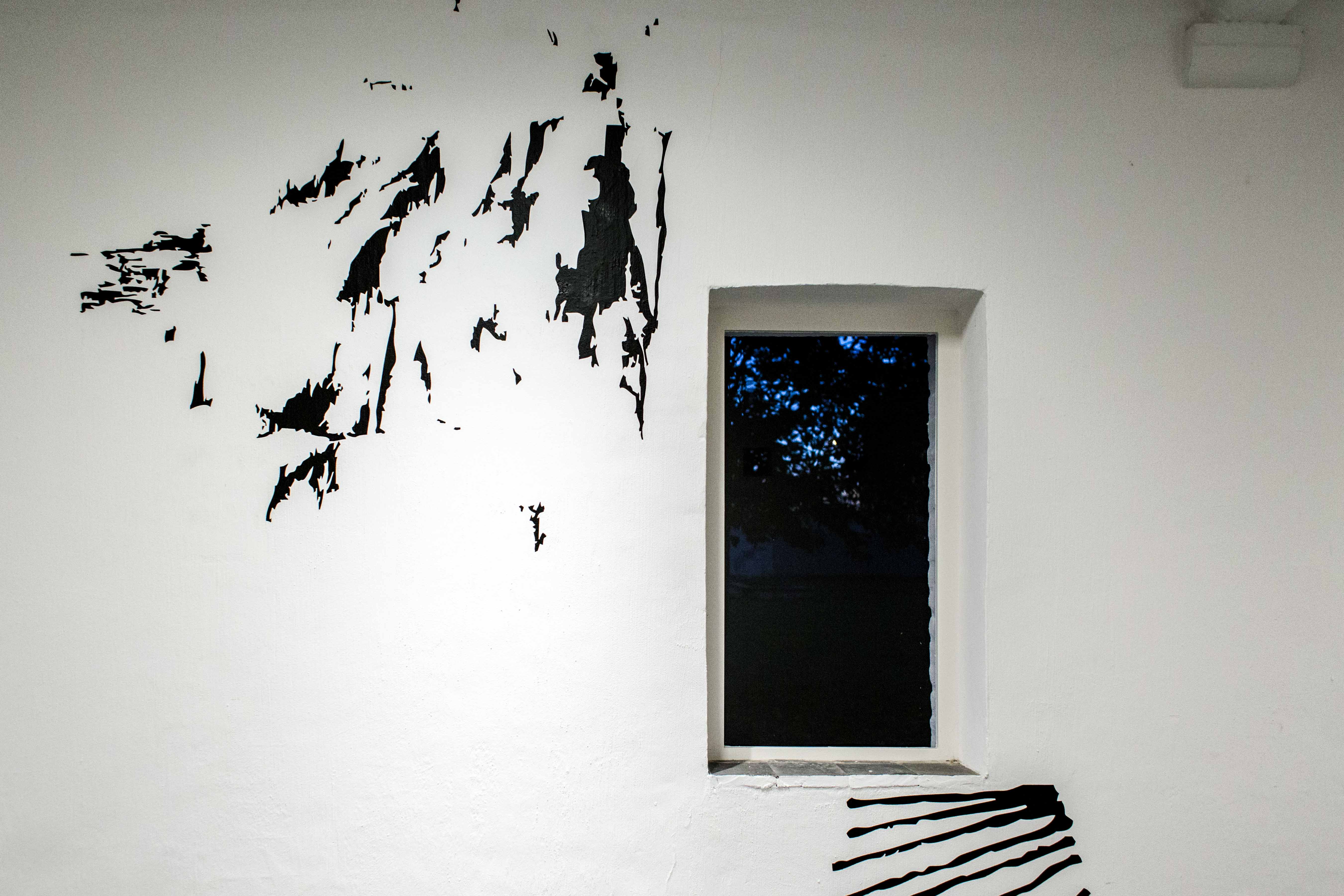
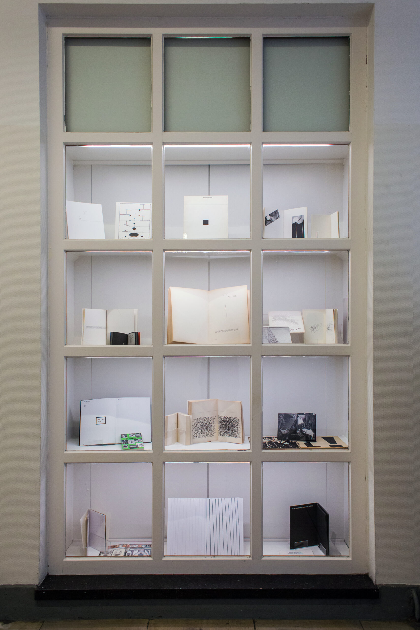
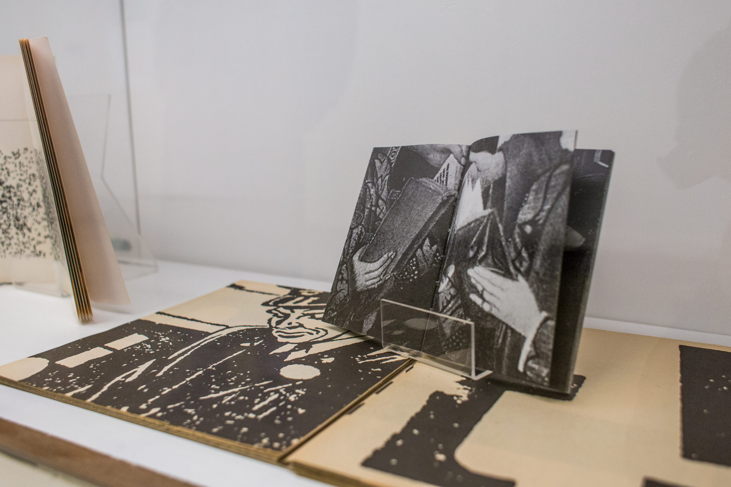
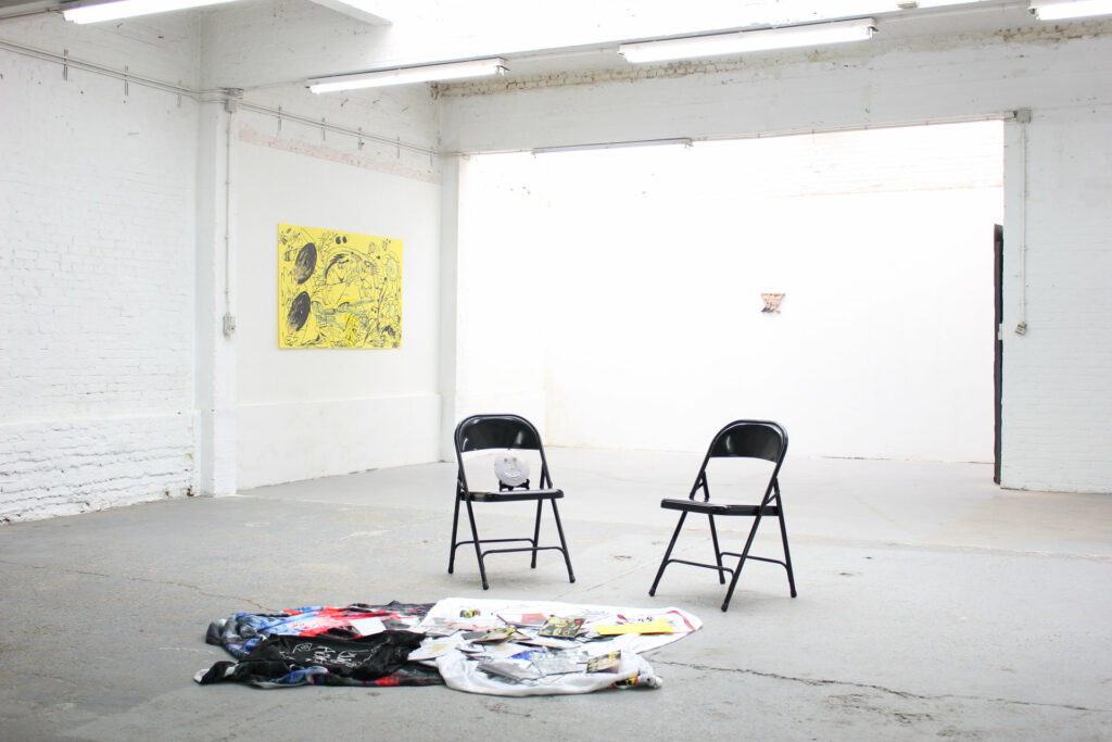
Deze vraag voedde het 'post-comics' project dat aan KASK uitmondt in een onderzoekende publicatie, een tentoonstelling, een projectatelier met de tweede en derde bachelor Grafisch Ontwerp, lezingen en een performance met en door betrokken kunstenaars. Dit alles toont zich in de BOEKS Gaanderij, in de 1M3, in de Kunstenbibliotheek en het daaraan verbonden Cellarium.
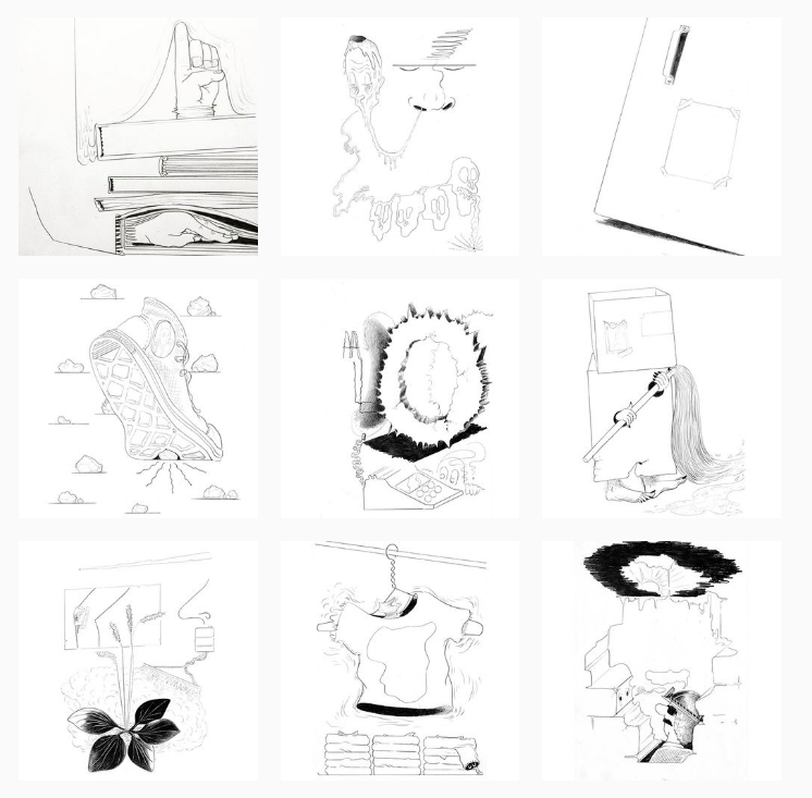
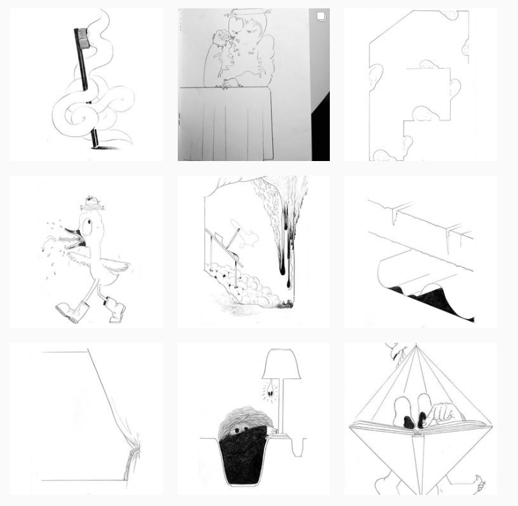
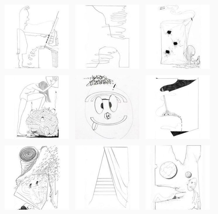
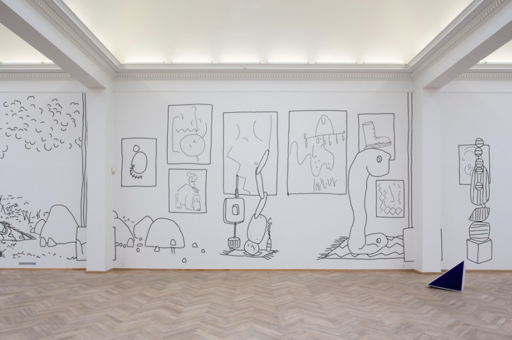
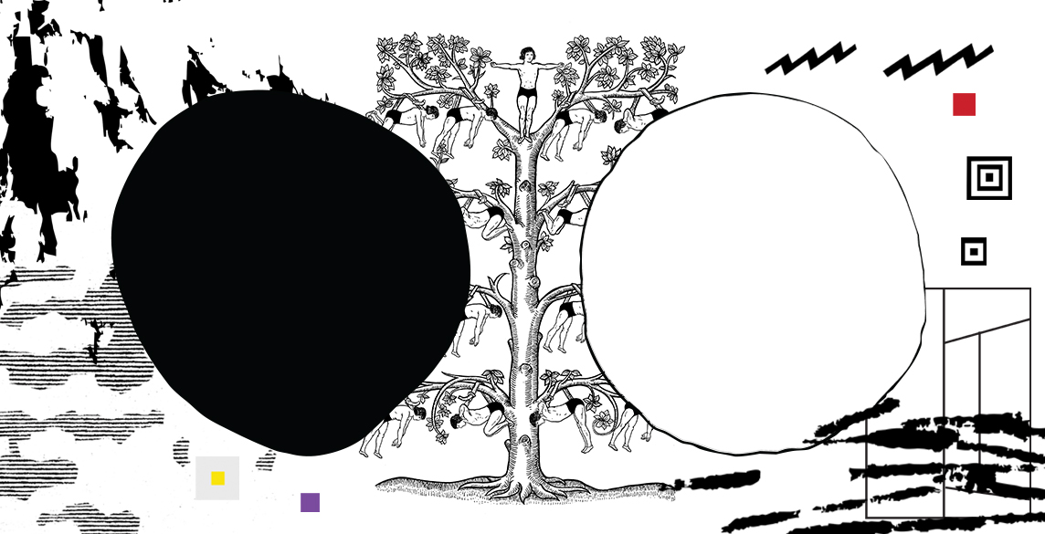
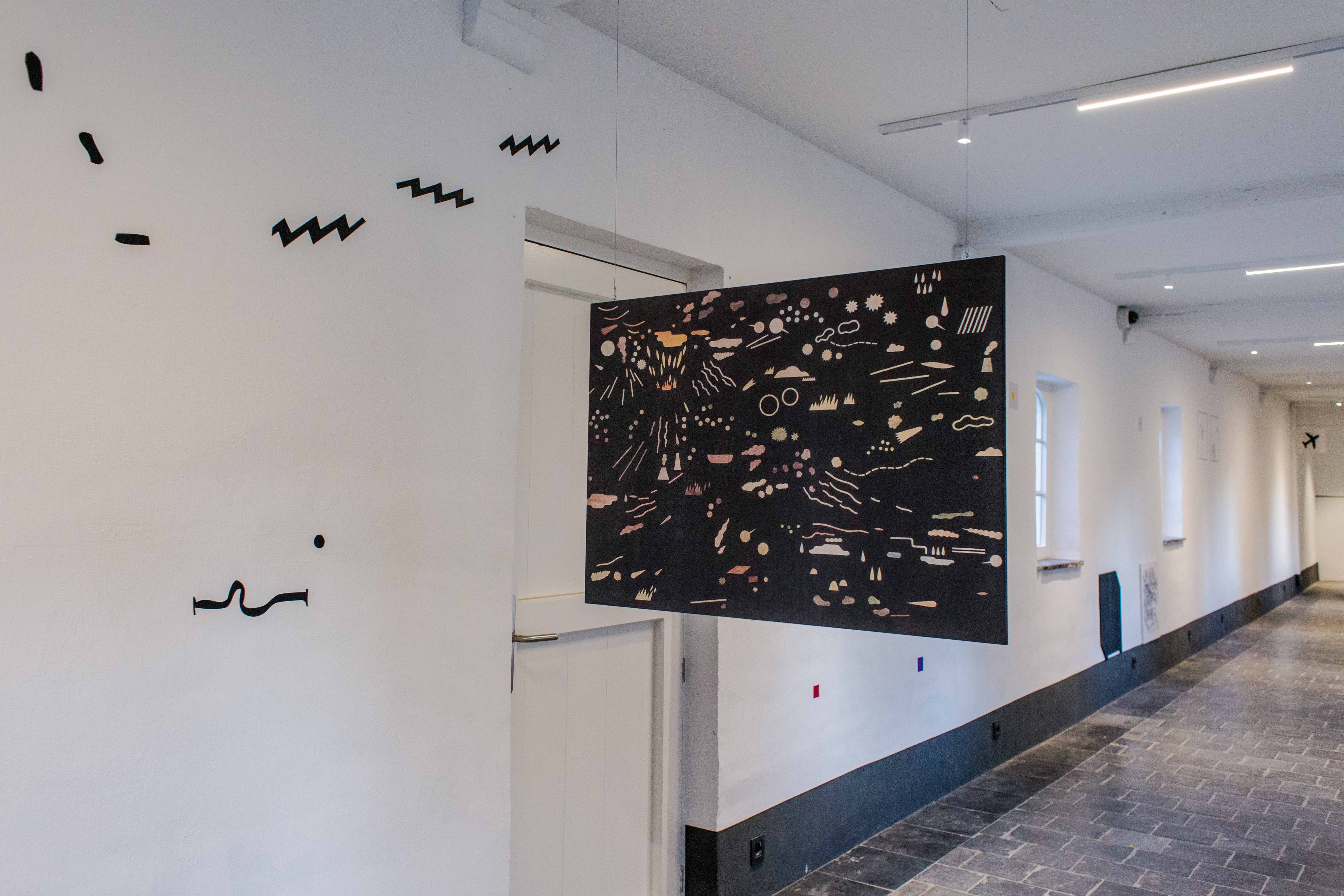
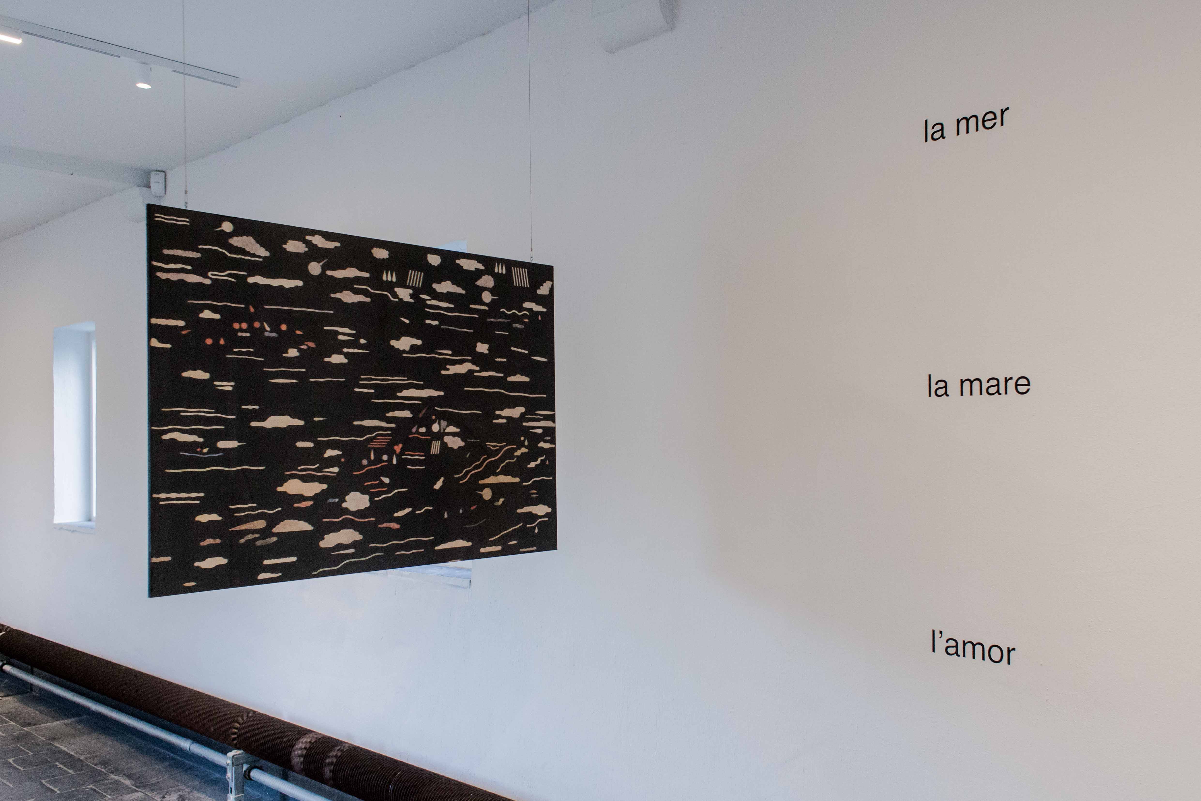
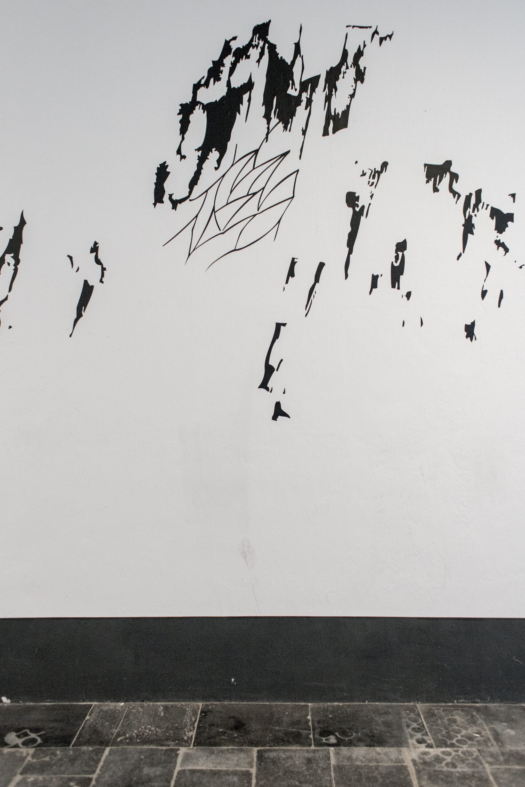
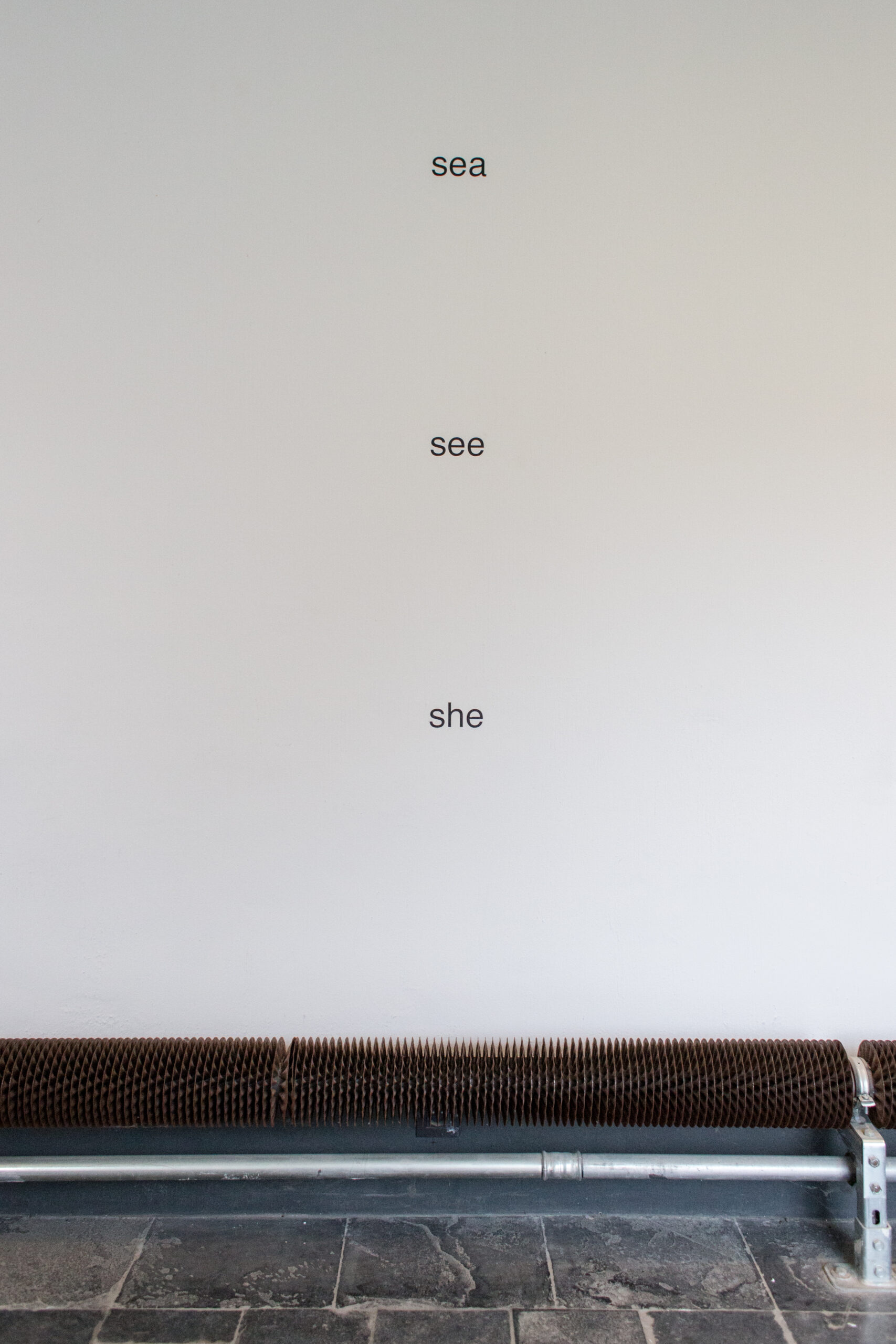
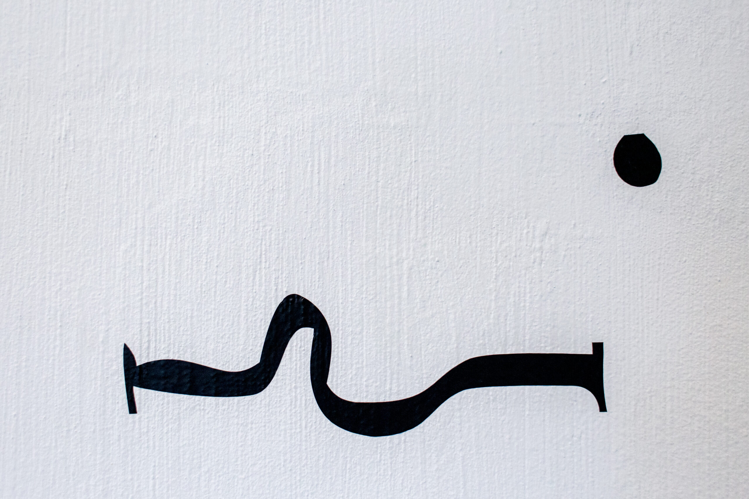
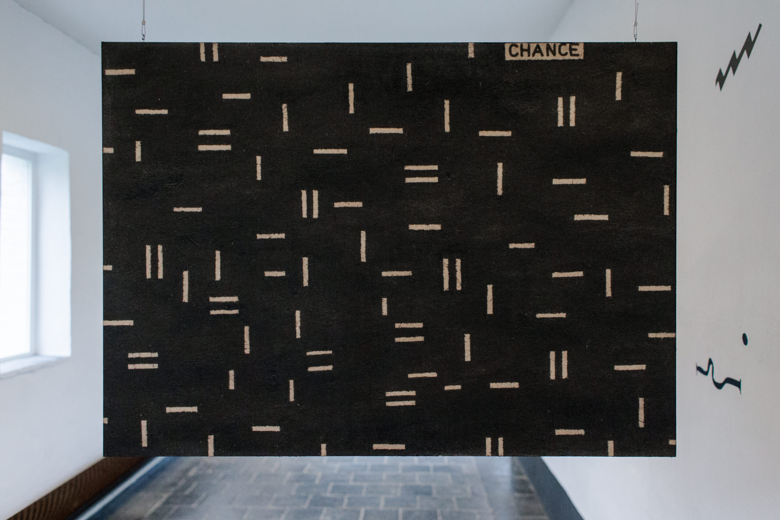
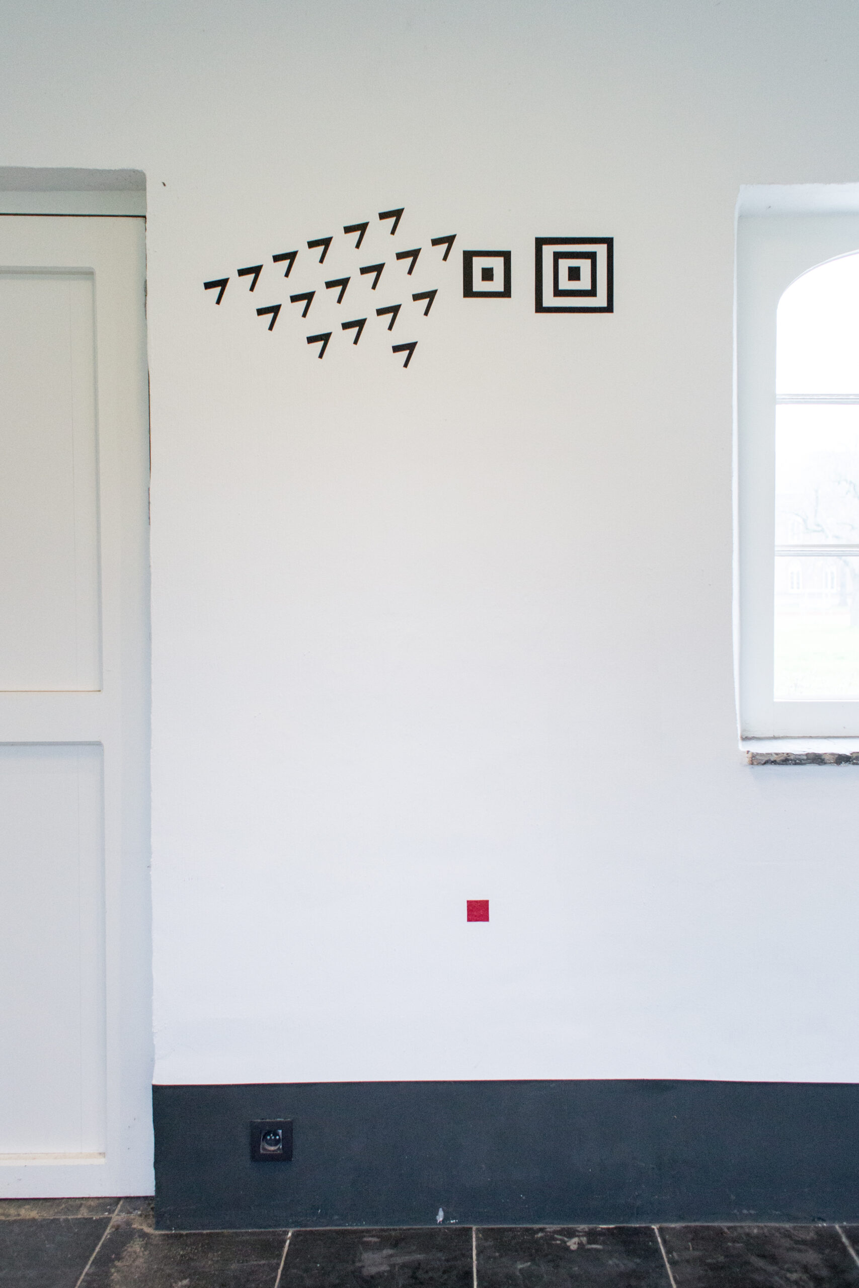
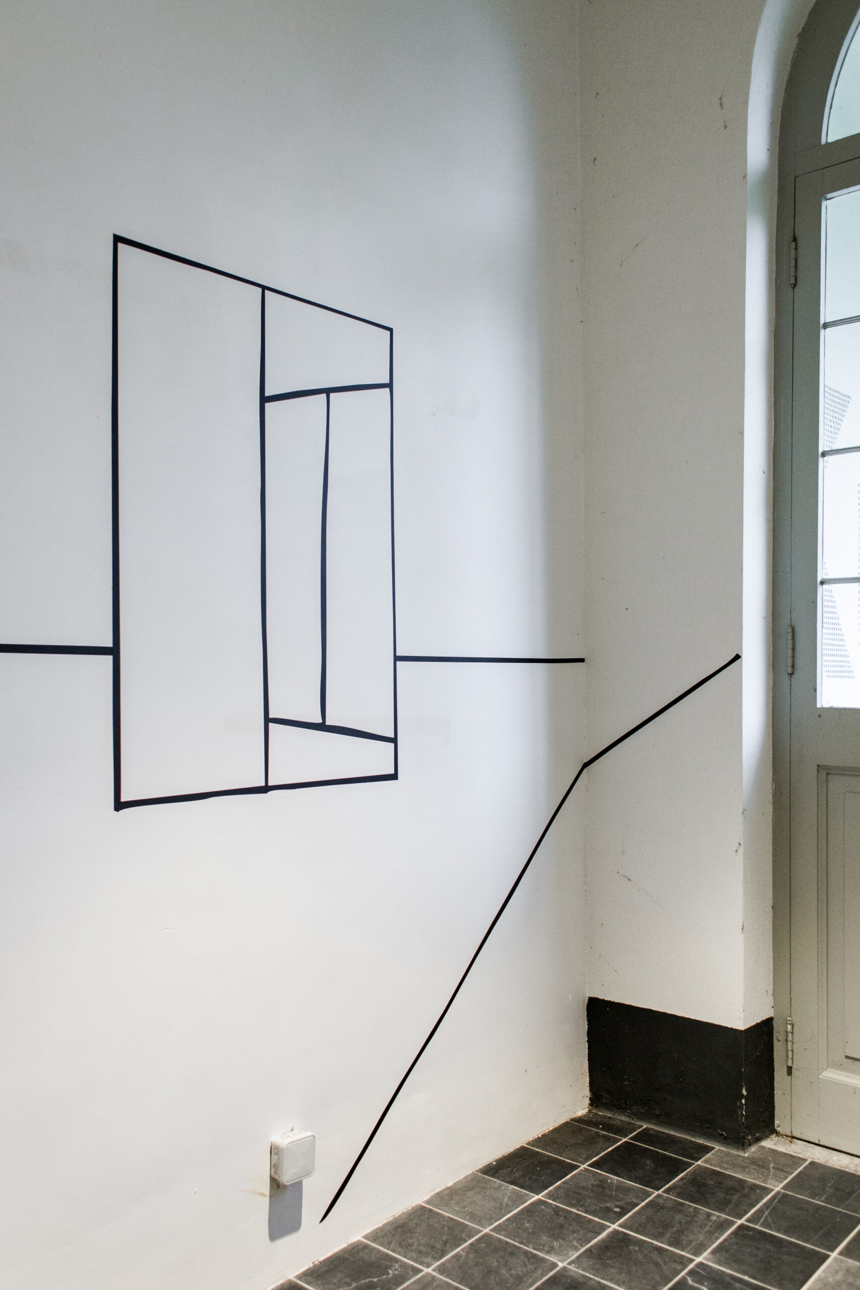
BOEKS nodigde Linh Dong uit om de uiteenlopende oeuvres die aan bod komen in de Post-Comics publicatie ruimtelijk samen te brengen in de gaanderij die naar de bibliotheek leidt. Ze verenigt de signaturen van zeven kunstenaarspraktijken in één op maat gemaakte installatie. Tientallen tekens staan op zichzelf, als zwarte schrifturen op witte muren, dragen slechts hier en daar een kleur, of vormen velden en roepen uiteindelijk één grafisch landschap op.
Linh Dong (1995, België/Vietnam) studeerde in 2018 af als grafisch ontwerper aan KASK & Conservatorium. Ze vertelt graag verhalen en experimenteert met typografie en gedrukte media.
De online Post®Comics fichebak zal blijvend worden aangevuld en staat open voor bijdrages — check deze pagina voor updates!
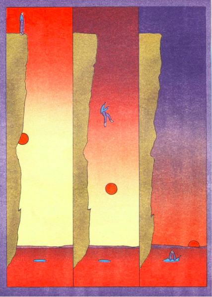
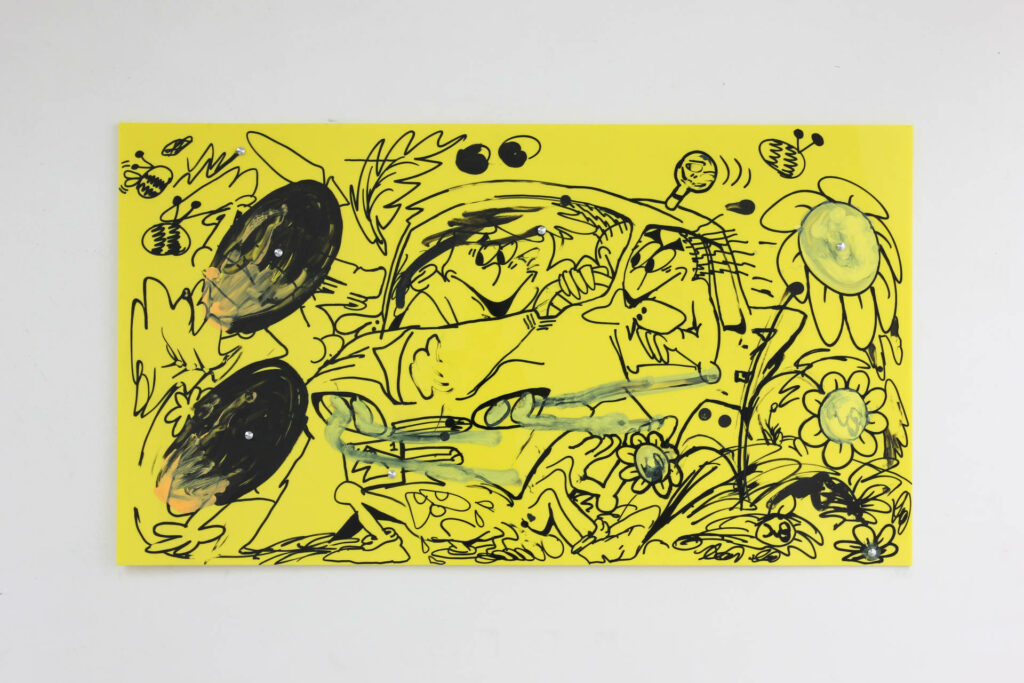
Felipe Muhr, “Blindsight”, 2015
**In tussentijd alvast het volgende over deze tot dusver niet-geïdentificeerde cultuurobjecten:
"Post-comics are much more than just another way of making or telling comics. What post-comics are doing is transferring the art of comics to different fields, different contexts, if not different artistic, cultural, technological and industrial worlds. These new environments may challenge postcomics the same way they themselves have challenged their initial comics setting." — uit het voorwoord van Baetens' Why do we need Post∞Comics?
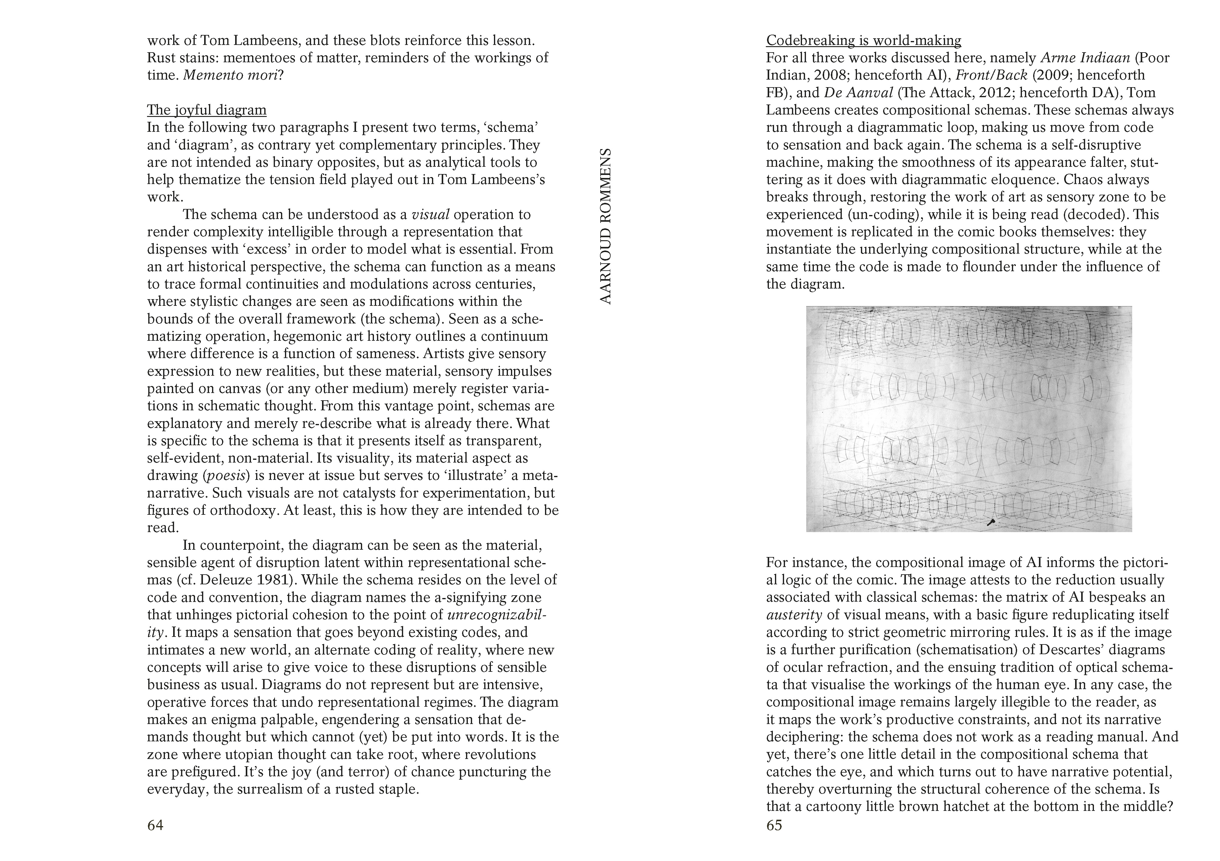
“Thierry Groensteen called comics a ‘uco’ or an ‘unidentified cultural object’. But even if they are still partly misunderstood, comics and graphic novels are by now culturally well appreciated. Against this background, post-comics appear as the kind of creations that are not easily situated, at least from a conventional comics’ point of view. Since the post-comics presented here mix several genealogies (art, comics, literature, cinema and so on) is it still valid to call them post-comics? Aren’t they just artworks and practices that incorporate comics traditions?” — uit de inleiding van Conard Post+Comics: A certain point in time


Foto's: Leontien Allemeersch


BOEKS 06:
Post•Comics
circling∞corridoring
•boekpresentatie & opening•
donderdag 22.10.2020, 18:00
•tentoonstelling•
23.10.2020 - 18.02.2021
•finissage•
donderdag 18.02.2021, 20:00
publicatie
Post-Comics. Beyond Comics, Illustration
and The Graphic Novel
2020
Concept door Sébastien Conard
Design door Thomas Desmet en Emma Vanhille
Uitgegeven door het balanseer en KASK & Conservatorium
170 x 240 mm, 124 pagina’s, Engels, oplage: 250
Met teksten van Maheen Ahmed over Felipe Muhr, Benoît Crucifix over Ilan Manouach, Charlotte Pylyser over Olivier Deprez, Aarnoud Rommens over Tom Lambeens, Maria Clara Carneiro over Jochen Gerner, Jean-Charles Andrieu de Lévis over Benjamin Monti, Jan Op de Beeck over Sébastien Conard. Voorwoord door Jan Baetens en inleiding door Sébastien Conard.
ook op het Post*Comics programma
donderdag 22.10.2020
•18:00•
opening 1M3 door Ilan Manouach en Sébastien Conard
@ KASK, Inkomhal Pauli
+ opening Post-Comics / Post-Practices tentoonstelling door Chiara Becce, Suzy De Laere, Ieva Liba Ratniece & Adelina Rosseel (bachelorstudenten Grafische Vormgeving, Grafiek en Illustratie)
@ Kunstenbibliotheek, Cellarium
•19:00•
drukperformance door Olivier Deprez & Roby Comblain
@ BOEKS, Gaanderij
•20:00•
KASKlezing door Tom Lambeens
@ KASK, Cirque
Kan een kunstvorm worden wat hij niet is? Kan het stripverhaal of de graphic novel bijvoorbeeld, ontpoppen tot 'iets anders' in dit fluïde ‘post-medium’ tijdperk?**
Deze vraag voedde het 'post-comics' project dat aan KASK uitmondt in een onderzoekende publicatie, een tentoonstelling, een projectatelier met de tweede en derde bachelor Grafisch Ontwerp, lezingen en een performance met en door betrokken kunstenaars. Dit alles toont zich in de BOEKS Gaanderij, in de 1M3, in de Kunstenbibliotheek en het daaraan verbonden Cellarium.
BOEKS nodigde Linh Dong uit om de uiteenlopende oeuvres die aan bod komen in de Post-Comics publicatie ruimtelijk samen te brengen in de gaanderij die naar de bibliotheek leidt. Ze verenigt de signaturen van zeven kunstenaarspraktijken in één op maat gemaakte installatie. Tientallen tekens staan op zichzelf, als zwarte schrifturen op witte muren, dragen slechts hier en daar een kleur, of vormen velden en roepen uiteindelijk één grafisch landschap op.
Linh Dong (1995, België/Vietnam) studeerde in 2018 af als grafisch ontwerper aan KASK & Conservatorium. Ze vertelt graag verhalen en experimenteert met typografie en gedrukte media.
De online Post®Comics fichebak zal blijvend worden aangevuld en staat open voor bijdrages — check deze pagina voor updates!
Felipe Muhr, “Blindsight”, 2015

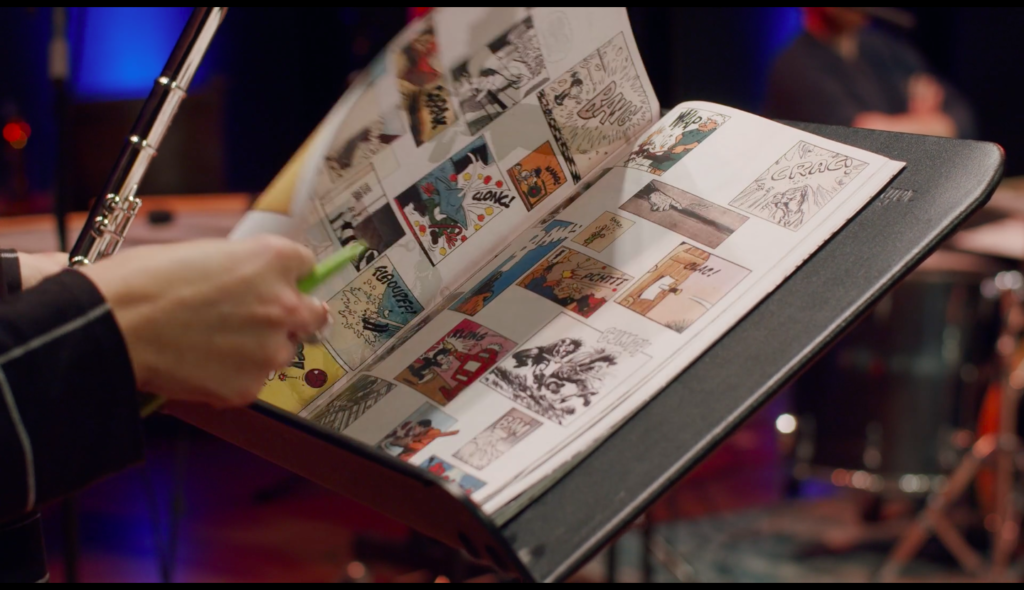
How better to conclude the Post*Comics exhibition, book and ongoing online slip box project than with Christian Marclay’s To Be Continued? The question of how, for example, the comic strip develops into ‘something else’ in this fluid ‘post-medium’ age brought us, among others, to post-comic pioneer Christian Marclay. The Swiss-American visual artist and composer has been cutting and pasting with sound and sight, film, photo, book and image since the 1970s. His continued attention for the musical potential of our daily lives led, among others, to the graphic score To Be Continued.
Published as a comic book in 2016, To Be Continued is a score for guitar, double bass, woodwinds and percussion, each page counts a duration of 30 seconds while being performed, “the speech bubbles are evocative of mood and dynamic, and should not be vocalized.”
The book consists of a 48-page patchwork of cutouts from comics. They narrate the complementing / conflicting musician / instrument / listener with a SNAP! – moderato – TAP – FLAOUPFF! in the snow – POPS! – hammering EEEEEEEEEEEEEEEEEEEEEE – Ça va durer longtemps?
Over 24 minutes time, under the guidance of Joris Blanckaert, Jacqueline Berndt, Lucas Messler, Sjors Vandermark, Sinouhé Gilot and Elliott Harrison, five students from the Ghent Conservatory Advanced Master Ensemble (GAME), twist and transform this chaotic multitude of characters and onomatopoeia into a one-time-only sound collage. Or in other words, “a long, sound-evoking-yet-silent poem that could be used as sheet music by a vocalist”
Here you can tune in on the livestream, February 18, 2021, 8 pm: https://soundofghent.be/en/event/miry/BOEKS (free, no reservation required).
To Be Continued was originally conceived for and performed by EnsemBle baBel.
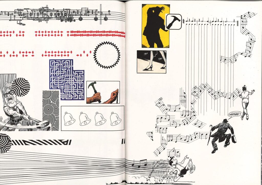
Christian Marclay, TO BE CONTINUED, 2016, published by Klangspuren Schwaz, 48 pages, 22,5 x 30 cm.
BROWSE ALL 48 PAGES HERE.
Listen to the 24 minute long recording HERE.
Now and then, this page will be updated with new cards indexing what we could call post*comics practices.
One by one, the cards slide into this many-colored ‘slip box’, meaning a non-linear note-taking system, or as some other tongues would put it: a ‘fichebak’, ‘kartotek’ or ‘Zettelkasten’. Sociologist Niklas Luhmann, famous for his extensive use of the index card files, called it his ‘second brain’ or ‘communication partner’:
“There can be several places of connection on a slip. In this way, a kind of internal growth (Wachstum nach innen) is made possible, depending on what kind of material for thought occurs” (from Luhmann’s essay Kommunikation mit Zettelkästen. Ein Erfahrungsbericht, 1981).
In the spirit of this working method we’re open to personal text contributions, short pieces of information that are taken down as they are acquired or other notes on post*comics artist practices, specific works and printed matter.
Contact us at boeks@hogent.be! To be continued!
Your communication partners,
Liene & Sébastien
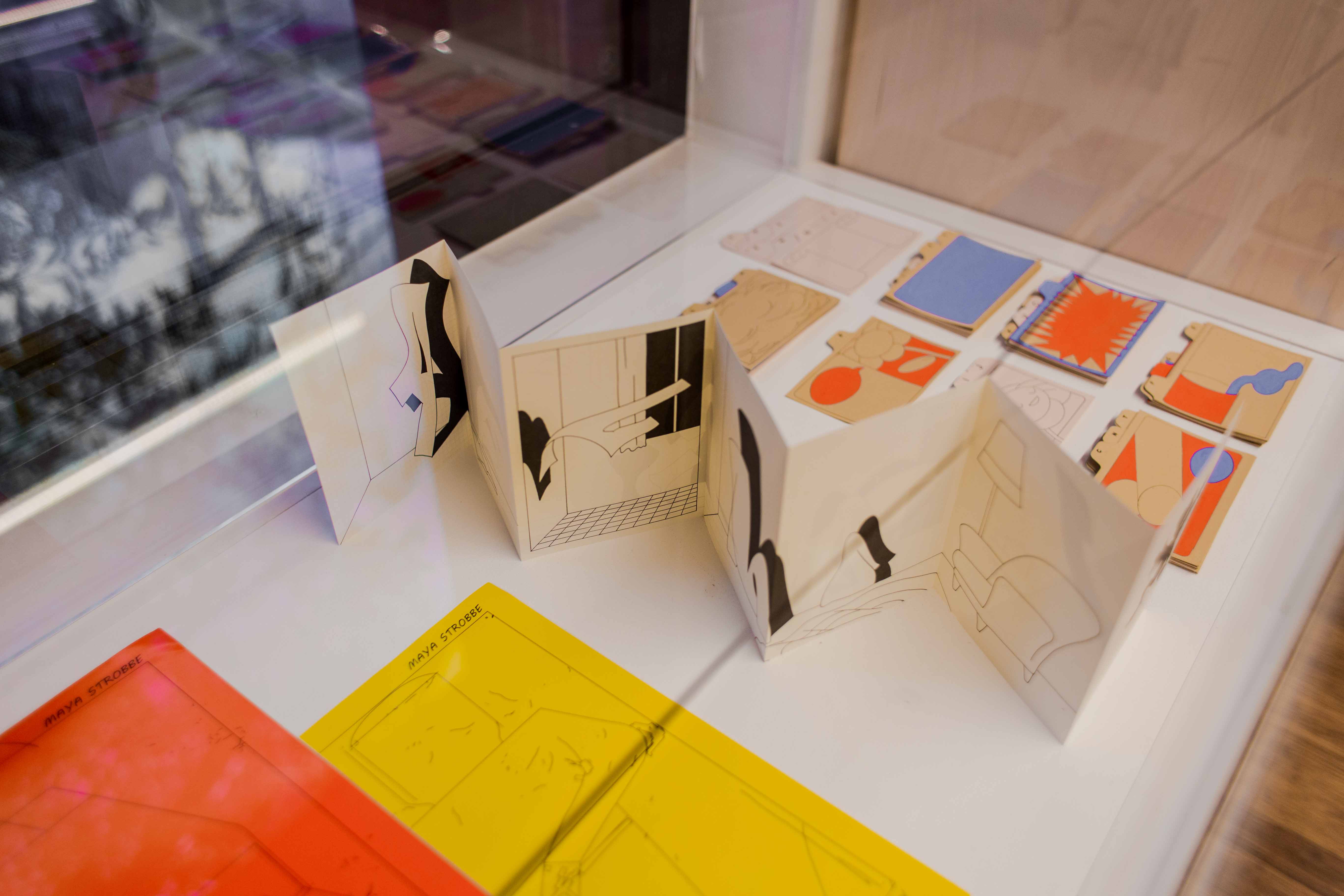
© Maya Strobbe
Danish-born Kasper Andreasen is an artist who works with several media including books, mapmaking, and painting. Andreasen explores the in-betweens of writing and drawing, underlining that the act of writing vs. drawing can be linguistically ‘illegible’ but visually necessarily ‘readable’. Or as he puts it: ‘Every form of writing is a place, a framework, and a registration of time.‘ Maps and other cartographic notations, perspective lines and viewing frames, territorial demarcations and road signs… all kind of (non-)signifying shapes, marks and traces tend to shatter, dissolve, and invent themselves in Andreasen’s expanding oeuvre. In a more recent project as P/A/N/E/L/S, for example, his slowly sedimented graphic vocabulary of dashes and dots, hatchings and shadings – reminding the notations of a blind man – hit by color which become the base of an utterly fresh and precise pictorial endeavor.
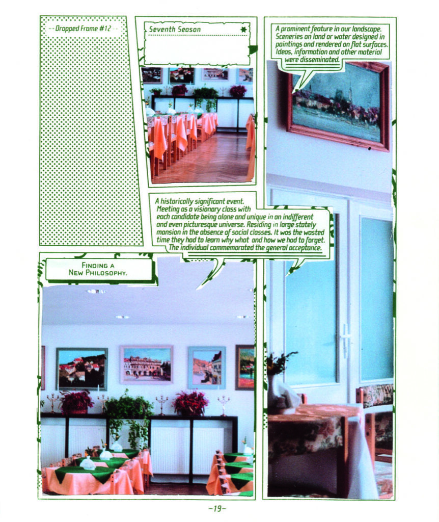
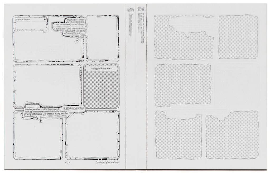
In the 28 plates of Bourgeois Poetry…, an early ‘stencil book’ (50 copies, 2002, Gerrit Rietveld Academy), Andreasen deconstructs an atypical comic grid as the basis for a multi-evocative publication. Through its form, the booklet reminds us philately of the kind of colored plates to be carefully ripped and then glued into an old-fashioned collector’s album. The cover of this publication, a loose color plate on its own, announces the productive program: comics gutters and frames are kept, the text within speech balloons is replaced by a more complex, reflective or intellectual monologue, while the supposedly original drawings have been (partly) erased, halftoned or masked by full color photos of a slightly kitschy dining room. We are obviously in front of a montage publication, but of a ‘negative’ one, proceeding by juxtaposing what is added or covered with what is (supposedly) left and hidden. The finding of ‘A New Philosophy’ is announced in contrast with the so-called banal pictures of the dining room, while what’s left of the comic book’s pages only appears as a reading structure (panels, frames, text). The front sides of the following plates, forming the factual corpus, show us scraps of halftoned (and thus illegible) frame contents – suggesting comic drawings at their origin. The versos show us the exact, emptied frames, with remnants of the mutilated drawings, and speech balloons and text frames referring to ‘dropped frames’ or, mostly, containing literary sentences that could be written by a young Nietzsche venturing into science fiction: ‘Another paradise, another home seen. Halfway through the tunnel that divides the days. We were left in space with shadows hiding between the curtains.’
For Andreasen, comics aren’t just a genre or a medium, nor only a material culture resulting from a certain industry and a specific economy, but even as a remnant or an anomaly, they presuppose connotations concerning the way we can read a thing (e.g. a book). As a visible structure, even or precisely because it’s mutilated, eradicated, the instantly recognizable look of a comic book imbues our seeing/reading of these coordinated image-text scraps with a very specific strategy…
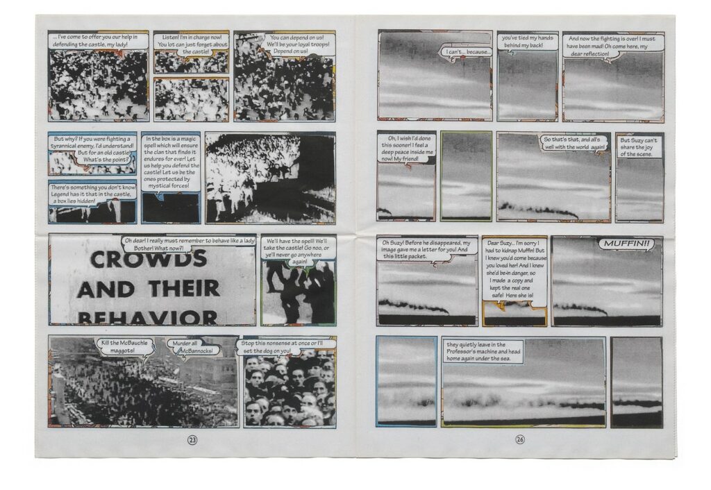
In Muffin Moments, a 2006 newspaper published by This Week, Andreasen completes the trick: by pasting cut-outs from tv and cinema images, including documentaries, erotic films, western, adventure and detectives films and so on, on top of the drawings of a re-appropriated comics adventure of Spike and Suzy (the English version of Vandersteen’s Suske en Wiske), the artist creates another cross-over photo novel. What remains is a pictorial and sequential narrative (more or less), but the funny and rather naïve text balloons comment upon alien material that nonetheless fits the purpose. It reads as if you were hearing Spike’s and Suzy’s voices, mistakenly commenting upon the deserted, cold surroundings of stolen and forlorn media imagery. (Paradoxically, one only ‘hears’ the unconsciously imagined voice of a comics character when it’s reassuring, graphic appearance is intentionally covered.) The jolly atmosphere of the comics’ dialogues now only highlights the endless solitude one feels when confronted with all the rubble of 20th century mass media. Within the utterly wastable format of a greyish tabloid, the sci-fi Nietzsche strikes again!
Sébastien Conard
contributor to the Post-Comics publication
Kasper Andreasen, Bourgeois Poetry, 2002, Gerrit Rietveld Academy, ed 50.
Kasper Andreasen, Bourgeois Poetry, 2002, Gerrit Rietveld Academy, ed 50.
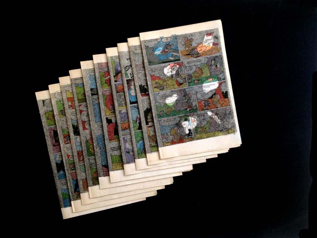
A graduate of HEAR (Strasbourg, FR), Pauline Barzilaï’s work applies drawing and painting to various print documents. Photographs, magazines, books, and comics offer print matter onto which she intervenes in specific ways. The intervention can involve color crayons, gouache, or lithographic printing: whether applied to glossy or pulp paper, each delivers its own kind of opacification or transparency. Barzilaï engages with cheap, second-hand comics found in local contexts. An Iceland translation of Tom & Jerry is overlayered with lithographic gray and turns it into a “dirty comic,” parsing gray spots that redistribute the readers’ gaze while leaving the underlying sequence visible. With Le long sommeil, an uneven black gouache covers the pages of a French pocket Superman title, breaking its gridded layout in abstract washy paints and four-color hues. La dernière guerre, self-published in the midst of the Covid 19 pandemic, applies gouache as camouflage to the pages of an amateur history magazine for WWII fans. The color gouaches smear out faces, warships, explosions, with more or less density and opacity. War is over, but we know it is not.
Benoît Crucifix
contributor to the Post-Comics publication
Maximizing in a minimalist and playful way the resources of vectorial drawing and risograph printing, Alexis Beauclair recently evolved from slightly post-surrealist or erotico-absurdist comics and zines like Perle and Sonde (2011) toward more object-like artist’s publication such as Enigma (2017) or Loto (2019). This last booklet, published by the avant-gardist comics editor Matière, looks like a hybrid between the by now well-established genre of abstract comics and clean designer books. If telling anything but the adventures of the little balls known from the famous ‘lotto’ chance game, one can also absorb Loto as the jolly, yellow visual pill from a nerdy drug designer. While Books & Zines is a metazine showing, well, books and zines in different outlined shapes, the intriguing Sol (in tribute to LeWitt) shows that varying vectorially and minimally within and with the comics grid can lead to a book object that looks like the very contemporary version of an op art publication. Booklets like Labyrinthe (2014) and Compositions binaires (2015) seem to be tapped from the same vain, running somewhere between abstract comics, op art and minimalism. What makes Sol so thrilling is that the use of the risograph is reduced to its essence, leaving all fashionable fetishism behind, and producing a clear yet eye-attacking object, that detaches itself from sequential narrativity while obviously resulting from mutational variations.
Sébastien Conard
contributor to the Post-Comics publication

Alexis Beauclair, SONDE, Volume 1, 13 x 19,5 cm, 448 pages, Impression Riso noir, sur papier coral book 90g, 100 exemplaires
numérotés et signés, 2011
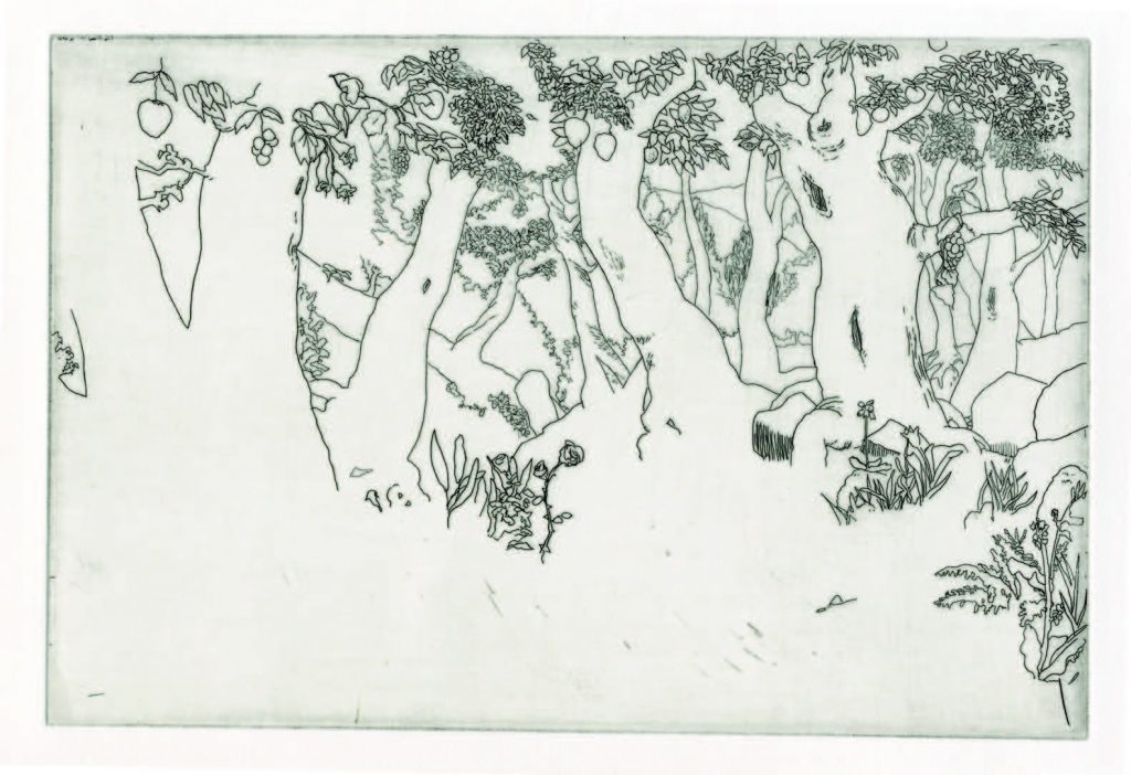
Frédéric Coché is known primarily for his accomplished, finessed work with etching, a capacity in which he has inspired artists such as Céline Hudreaux, who has recently released a finely etched adaptation of Poe’s A Descent into the Maelström (1841) aptly called Maelstrom (2019). A French artist part of the Francophone alternative comics, graphics and art scene, Coché is intimately engaged with the Belgian Frémok, a publisher that has greatly foregrounded the impact of method and technology on storytelling also visible in Olivier Deprez’s woodcut graphic novels. Indeed, sooner than described as making graphic novels, with titles such as Hortus Sanitatis (2000), Ars simia naturae (2002), Vie et mort du héros triomphante (2005), Hic Sunt Leones (2008), La mort du roi (2014) and L’Homme Armée (2018), which is partly oil-painted employing Coché’s other favored technique, the artist is described as making etched stories. Frédéric Coché’s generally wordless etchings are marked by a narrative ellipsis that matches his formally experimental approach. The artist, who also illustrates, exposes at the Parisian Galerie la Ferronnerie.
Charlotte Pylyser
contributor to the Post-Comics publication
Immersion, stratification, critique, Some aspects of the work of Sébastien Conard
Jan Op de Beeck
Excerpt from the post comics publication, Read full text here.
Sculptures and sketches, cloth and iron, the Belgian artist Muriel de Crayencour is not one to shy away from different techniques or media. Ranging from the abstract to the figurative, one theme in particular that glimmers through her oeuvre, forming the red thread interweaving her works: femininity. The rhythmic sensual forms of de Crayencour’s intimately-sized bronze sculptures – joyous, almost Mattissian nudes with flowing wavy hair, tactile mammary conglomerates (the Mamounettes) – can be read as homages and continuations of Louise Bourgeois’ oeuvre. Her fabric works and embroideries evoke similar connections. De Crayencour’s expressions of the feminine provide a playful, nonchalantly subversive counterpoint to Bourgeois’ anguished, assertive forms: magenta outlines of nudes partially obscure musical scores by the likes of Jules Massenet (Partitions). Similar nudes also appear on the well-worn covers and pages of novels and self-help books; illustration (super)imposes itself on the text. In works such as Choix des élus, the sinuous outlines of a female torso are sprinkled by buttons across the pages of the eponymous book, packed in a richly embossed jacquard cover stringed to a cream glove… a feminine desacralization of the written word, a feminization of the book object? De Crayencour’s books are alive: the pages and pages of print reworked and bejeweled throb with emotion even before we begin to read them.
Maaheen Ahmed
contributor to the Post-Comics publication
Even in the most recent version of Hello, are we in the show? (2020), a technically sophisticated video installation made with a specialised team, one descries a desire to “go outside”, to embark upon the world in a receptive, exploratory, contemplative and involved way. When you stay on the shores, the swan will come swimming towards you. (Hello, are we in the show? (comment voir la même autre chose), SMAK, 13 February – 30 May 2021) In each case, Denicolai and Provoost start from specific social contexts, the social processes co-shaping the artistic processes.
Owen Spark, who has been appearing in newspapers and magazines since 2000 (the triple-Suzy-head year), does not have an easy-going substance. At best, he is our apparent comic-strip fellow, like a friend or acquaintance suddenly lapsing into his shadow, his inherent and onerous strangeness. Spark’s main point of identification is not an oval container separating inside from outside. Indeed, his head is a cube, or a semiotically understood cubist faceting, a modernist module or sculpture, an apparent basic unit, a block (or a box of blocks), a Broodthaersian “moule”-like empty reservoir, a blank projection screen akin to the discrete but nevertheless embodied position of the psychoanalyst. In an interview, Denicolai and Provoost argue that Owen Spark’s presence as a silent, passive witness to the world is similar to the way in which Daniel Buren’s work functions as an “outil visuel” [“visual tool”] that draws attention to the context in which it is placed: “He is the number one witness to things, to the world. […] What he sees is what he is. […] The drawings do not have a direct link to the content of the articles, but rather to a more general kind of topicality.” (Tribune de Lyon, n° 373, 2013, website D & P).
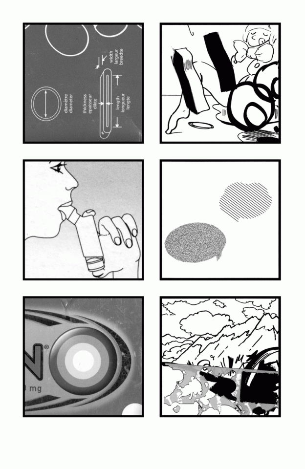
The installation A dream called Macba, Moca, Moma, etc (2010, 2011) shows the way in which the experience and possible “documentary” of everyday reality becomes entangled in the hybridity of myriad apparatuses, such as art centres (EACC, Castellón, Spain), fish markets (Mercat Central, Castellón), screens, exhibition panels, municipal notice boards, journalistic newspaper photographs, printed-paper fish wrappings and plastic bags, recorded sounds, cartoonish sound effects, Disney-cartoon language and ditto posters. In the vein of A dream…’s serious consideration of that which is childish, silly, commercial and unsightly, of concrete and metaphorical waste as the continual dream that animates us and our reality, the rationalised comic-strip panels of Comic (2004) form an ever-jolting prism. The work correlates sketches, diagrams, scribbles, noise, comic-strip stylistic devices and clichés, (often cheaply) reproduced packaging of sedatives, painkillers and antihistamines, of the intoxicating exoticism of Ceylon tea and Arabic fruit and tobacco brands, of a cake mix loved by children. The comic-strip panels demonstrate a relation to the violence of capitalist cut-outs and reproduction. The small bombardment of positive or negative fetishes, edulcorations and pharmaceutical stopgaps prove a broken dam: the discomfort visibly lapses into confusion, restlessness, boredom, desperate aggression and hot-blooded baloney. The “action” has been reduced to poorly resorbed impulses.
In the similarly structured Comic – Tout Public (2010, an epilogue to Antoine Boute’s book Tout Public), circles, ovals and arcs of all graphic kinds are a central motif. In commercial comics, for example, lines shooting away, dashes echoing, strokes and “swirls” form an index of movement, and the smooth and dynamic comic style itself suggests liveliness and nervous activity. Here, the informally handwritten bottom price (99 cents) is followed by the glow of a bourgeois floor lamp, the strip-like glow of a telephone pole by the clean digital trajectory of a rocket popsicle. Somewhere in between, the ideology of authentic expression is panting with a chiaroscuro pout. The second page opens with a didactic diagram of dimensions, the circular “diameter” in particular resonating in the instructions for an inhaler underneath. The technological depiction of the oral, of lungs and oxygen is continued in Hergé-like snowy mountaintops, in which the ligne claire has turned into a cliché, a kind of consolation for the figurative lack of oxygen. In the lower half of this healthy mountain air, the action is as stylised as the onrushing digital representation of a painkiller.
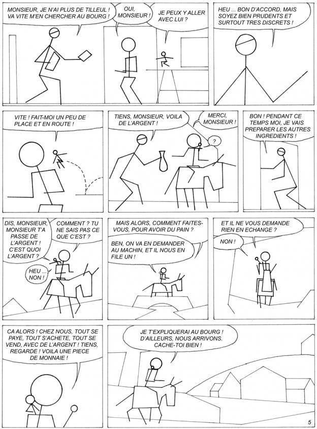
Le machin financier (2014) is a “(s)tripped-down remake of album number 16 in a popular comic book series, in which an equitable community wagers its well-being and insouciance for the introduction of a monetary system. (Under Free Art Licence 1. – price to be determined by the buyer)”. Rather than “abstracting” the figures, houses, objects and landscapes into similar and corresponding stick figures, elementary contours and planes, this bare comic suggests that on the market everything and everyone always already is an abstraction to each other. Social relations, labour (“work”) and its “products” are imbued with monetary-based evaluation. The formerly more or less pleasant, perfectly inefficient activities and being together of this small people (joking around, singing, writing, taking a nap, partying) meet their – lack of – (exchange) value within this horizon. Each individual is a “machin”, which means “what-d’you-call-it” or “thingummy”. (brochure accompanying the exhibition Hello, are we in the show? (comment voir la même autre chose)) And money is the ultimate “what-d’you-call-it”, a fetish par excellence, something that is worth nothing in itself, but makes you fantasise about all the things you could do with it – a meaningless entity that promises Everything. Le machin financier articulates something of that which is unconsciously practised in a capitalist community, just as the ideology-critical spectacles in John Carpenter’s film They Live (1988) violently break with everyday “human” experience, revealing the arid, colourless and alienating dimension of capitalism. (Slavoj Žižek, The Plague of Fantasies and the film The Pervert’s Guide to Ideology)
Jan Op de Beeck
contributor to thePost-Comics publication
translation by Sis Matthé
Denicolai & Provoost, le machin financier, 2014. (“Under Free Art Licence 1. – price to be determined by the buyer”)
Denicolai & Provoost, comic – tout public, 2010. Published as an epilogue in Antoine Boute”s book Tout Public.

Denicolai & Provoost, comic, 2004. Published in Joe Dalton #1, 500 ex./march april 2005.
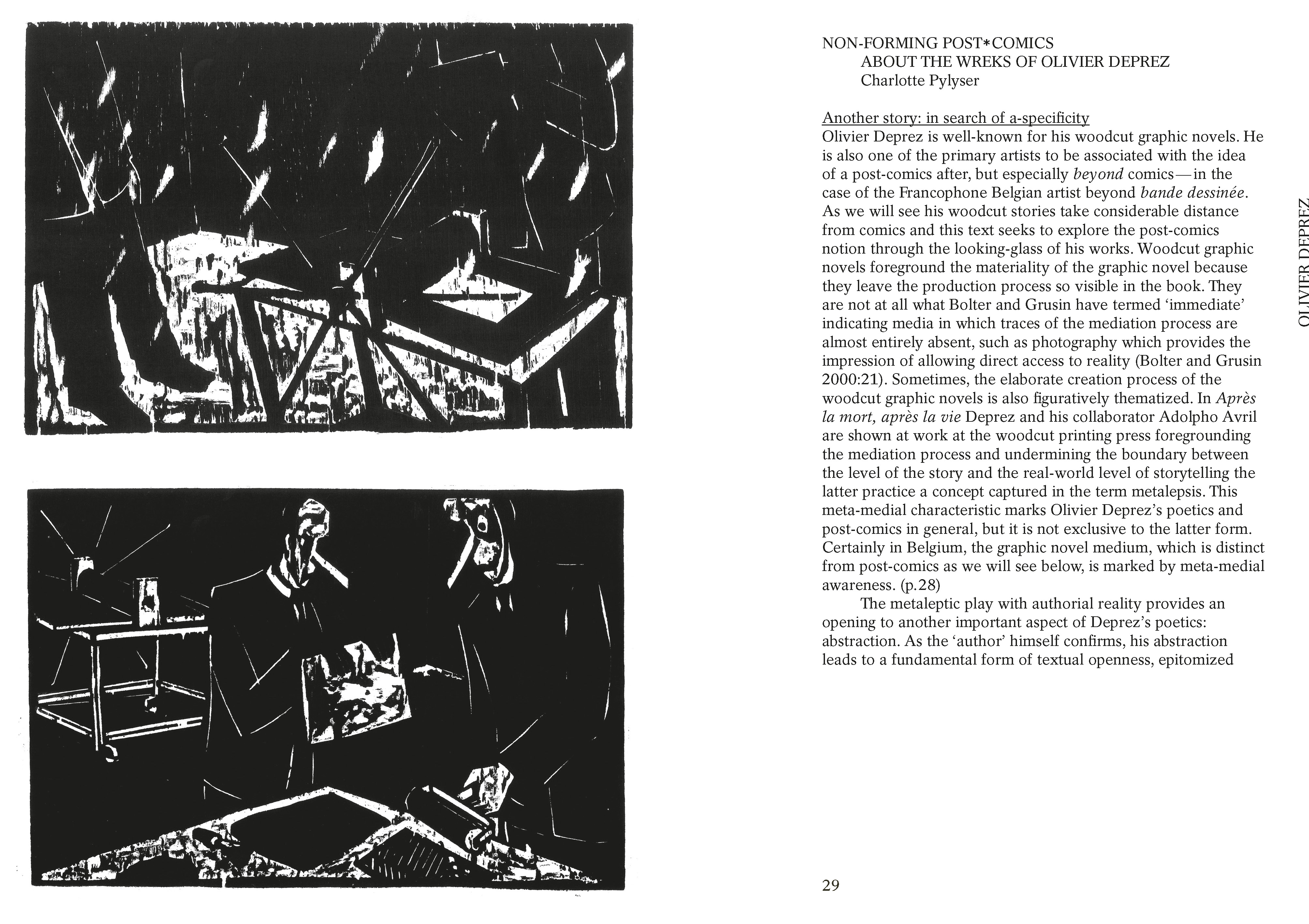

Non-forming post-comics, About the WREKs of Olivier Deprez
Charlotte Pylyser
Excerpt from the post comics publication, Read full text here.
Un Falduo is formed by Nicolás Daniluk (1981-), Ezequiel García (1975-), Nicolás Moguilevsky (1984-) and Nicolás Zukerfield (1982-), an “art collective exploring and experimenting around comics”, which they drift into visual and musical performances. Since their first publication, the comics take part of a metacritical work, in which they appear as interference: retraced, deformed, or minimalized in a geometric form. Their book La historieta en el (faulduo) mundo moderno (2015), derived from a performance, was turned into an exhibition: in each of those, Un Faulduo develops a sort of palimpsest over the Argentinian critics Oscar Masotta’s (1930-1979) theoretical text, recovered by drawings, staged with music. Using technics and concepts of the Situationists, they affirm that “comics are the art of copying”, and as they map their imaginary bases, they also operate in a disintegration and reintegration of comics, where ripped parts of a mural became covers of a zine, or the symbolic argentinian masterpiece El Eternauta (Oesterheld, Breccia, 1969) is decomposed in its creation tools, in its author voice.
Maria Clara Carneiro
contributor to the Post-Comics publication
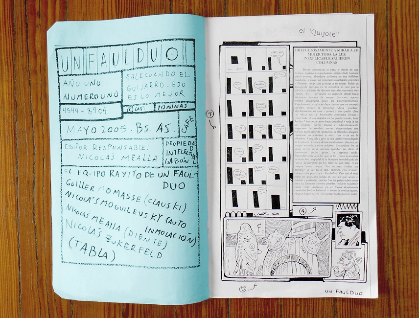
2005, Dirigido por Nicolás Mealla, Este número inicia la publicación trabajando a partir de los extraños principios de la tergiversación. Tirada de la primera edición: 86 ejemplares, Fotocopia, 35cm x 22cm, 14 páginas.
Since a couple of months, when on Instagram, I land on laetitia_gendre_’s page now and then. Today, a Monday, December 7th, I decided to stick around longer than usual. I dropped deep, two years back, searching for the day on which her first drawing found its way to this landing site. It was a March 23rd, a Friday in 2018 depicting a frottage of a MacBook laptop. In hindsight a maybe meaningful beginning of her still ongoing, and only online presented series of drawings, titled META. A lot of Gendre’s days contain the making of a drawing: starting from a blank space “where I didn’t have to think at all before doing”, experiencing moon landings over and over again. In the meanwhile, more than 300 drawings set their first step on a sheet of A4 paper. But they don’t get to see the light of day for long. They exist almost exclusively online on social media, lit by the screen. Thus far only very occasionally the drawings were shown in real life and even then, only in a reproduced manner. For example, as a slide show projection on a wall painting for SecondRoom in 2019 or as printed, tear-off blocks for an upcoming group show at the Centre de la Gravure et de l’Image imprimée in March 2021.
Scrolling forward in time again until the third drawing pops up three months later: a bunch of mushrooms growing out of a mac keyboard, the spindly cone cap kind. Half a year later I get to meet the one behind the laptop, sitting at the other side of the table staring back at me from the chest eyes (there is no head), greeting me with a “Good morning” hashtag. From that moment on, the free-floating mind starts setting up the framework on which this ever-growing META story could take place. It’s the beginning of 2019, by now a more on than off daily drawing practice is in the making.
With “the right tool, the dreamed tool”, every boxed being can find its escape routes, along frail borders and bottomless gutters. I take the time to slide along, to observe from the outside looking in, in between upright panels and a predefined grid, cavities full of exploration and spontaneity. I sigh a silent Aha (altogether lost from found in whirlwind wormholes) from behind the heavyweight, inert drapery. As a comic book world to fall into and to “spring sprung sprong” out of, with a story line, a family of characters, splashes and game changers.
When this upside-down, black & white site shows signs of life, it’s full of contrast. It faces me with ghostlike apparitions, with anonymous, numb human types on the one side and otherworldly, but mostly friendly and endearing expressive ones on the other. During a couple of weeks in March and April, the life over-screens seems extra bored with ghouls burning holes or counting seas of META time. From within their box, they endlessly stare at each other or into the reflection of the screen. It’s mostly silent. Unless a bird leaves a note to fake the (unknown) Spring time feeling or an explosive effect like this happens. A hard CUT out of the desire for the long-awaited anew. Another empty page reveals itself with bravado.
Monday, April 20th, 2020 behaves like a bookmark. It signals a special moment: from this day on most of the panels are marked with their day of birth. The feet of the tracker go right, while its right hand points to the left. We come from the right, so let’s go left, a busy week ahead (its Friday looks like this, hardworking and unhindered, making ∞∞∞∞ while the walls are drooping away). Sticky speech and empty balloons bounce in between underground fantasy chambers and eerie realistic ones with window curtains bound with a curtain cord and living rooms bordered with room plinths. #Tournerlapage #coucou. The spider web says it’s about time to turn the page.
The tripping continues. Another Monday, September 28th, 2020: an eye taps the cornea of another eye, impatiently awaiting its turn to take a peek into the awaiting fall, one of isolation with books with hairdos as evening companions. They forecast a trail of clashes and then a BANG. What will the future bring? Nothing worse than not knowing… especially when trapped inside a box, the sole of a shoe or a contaminated nose. Nothing else to do except for hibernating while the walls close in and the eyes drop out, dreaming of faraway highlands it has seen once in a book.
Which raises the question: if all this comes together in one, how would it look like and how would it behave? This self-contained (series of) world(s) share(s) the same space and timeline. At the same time however, we can only wonder how the(ir) back-end(s) looks like. Only now and then a figure passes by a panel—assuming they can also function as windows of one shared living room instead of 300 enclosed container chambers. I do believe they wink at each other through repetition, puns and effects, sharing the same standard living conditions. Over the years, they find themselves entangled or stung more than once as if the master’s tools, like pencil and panel borders, are paying a visit in disguise—a subtle prick as a reminder of the fact that they play a part in a bigger set-up. The structure doesn’t provide perspective nor exit doors, only the systematic creation of more same sized panels, standing side by side in a fixed grid, pushing aside the one after the other, with each new row the page flipping continues. They move backwards, counting but also skipping the days. They can’t fall off the grid, but once posted they rarely make it to the front of the screen again. So maybe there is some kind of vague vanishing point for the META-dwellers, one of oblivion through time—
—or straight into the physical world using a loophole, a thought Laetitia Gendre is currently playing with: “It seems this series finally moves more and more towards the centre of my practice. (…) From the beginning it was very clear that it makes no sense for me to show the originals, it can only work as a series that would ideally be all gathered in a book one day.” This makes the latest news only more hot: only a couple of minutes ago a new drawing of smouldering computer screens made its appearance. A bonfire for contingencies and collaborations to come!
Liene Aerts
coordinator of the Post-Comics exhibitions
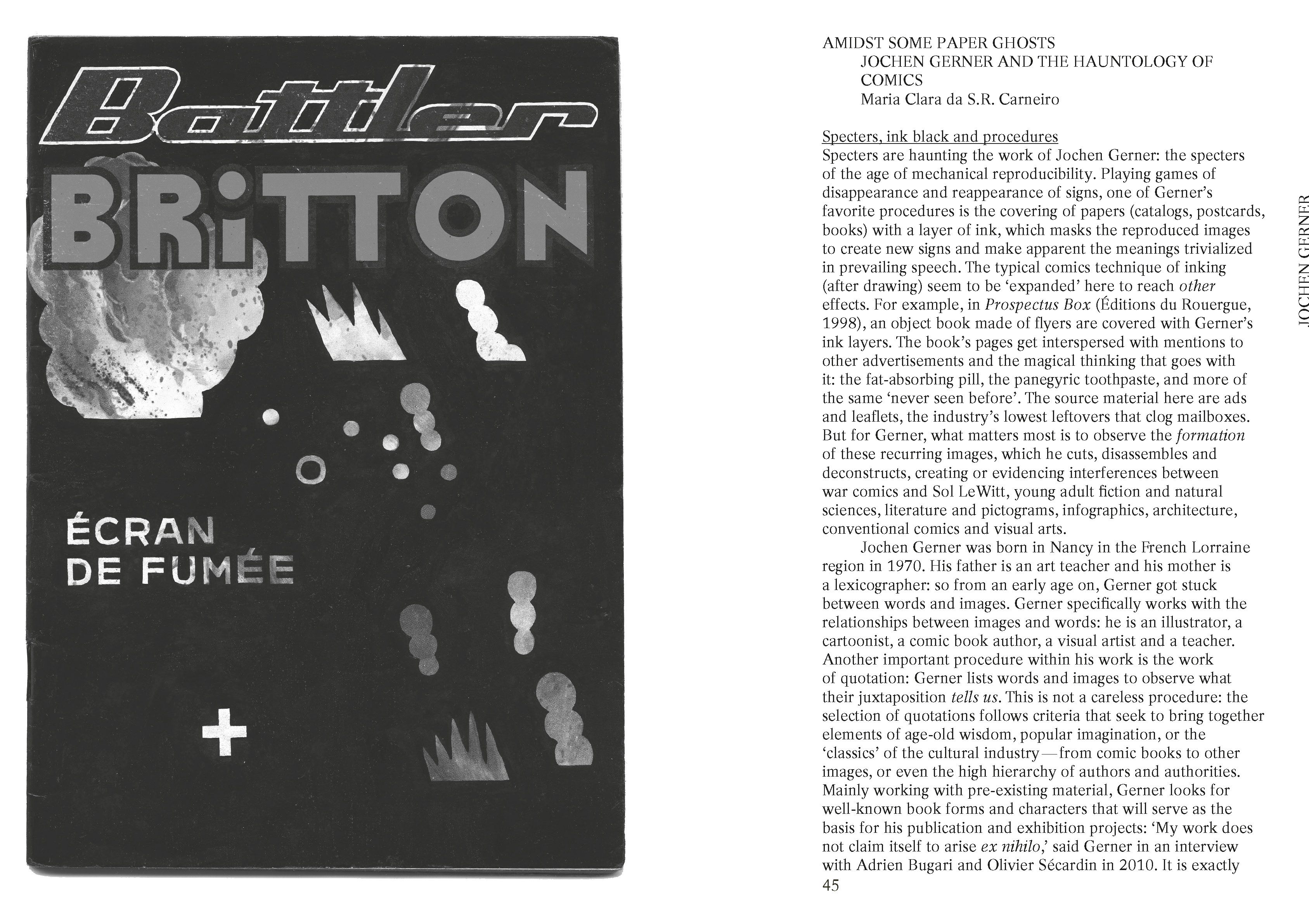
Amidst some paper ghosts, Jochen Gerner and the hauntology of comics
Maria Clara da S.R. Carneiro
Excerpt from the post comics publication, Read full text here.
Blackbirds and jays are two omnivorous birds. Their diverse diet ranges from insect larvae to cherries, from chestnuts to small lizards, from earthworms to blackberries. At the other end of the spectrum, Jérémie Gindre’s work is equally characterised by its diversity: from publications to exhibitions, from novel writing to sculpture, from short stories and non-fiction to Indian-ink drawings. There are birds to be found among his drawings, but none of them are blackbirds or jays. Instead, he chooses to draw – or rather to redraw – common swallows and bullfinches from selected speci-mens in the Atlas de poche des oiseaux de France, Suisse et Belgique, utiles ou nuisibles [Pocket Atlas of Useful and Harmful Birds of France, Switzerland and Belgium]. He reproduces their main features for the series Nuisibles, utiles & indifférents (2013-2015), making sure to get rid of the original colours, captions and any reference to the original work of 1898.
Many of Jérémie Gindre’s drawings operate according to the same principle of sampling and cleaning, which could be roughly summarised as follows: selection of a printed source, extraction of a motif, reproduction of said motif, simplification of forms and lines, recirculation in an exhibition. In addition to the scientific (ornithology, geology, botany, geography) handbooks that he is so fond of, comics provide Jérémie Gindre with a large supply of potential images and motifs as well. The series La rivière vue des rochers, for instance, takes up panels that include watercourses from Tintin comics removing the characters and leaving only the backgrounds. When the series is displayed on the wall, the drawings are hung in such a way as to recreate a simple narrative, starting with the source, then the river running through the mountains, cascading down, growing larger as it flows. Nothing explicitly suggests that these are redrawings of Tintin panels, except maybe for Hergé’s familiar ligne claire.
Whether they come from stories by Hergé, Carl Barks or Joe Daly, the comics sceneries reproduced by Jérémie Gindre are “cleaned” in order to serve as a background for new stories, such as in the exhibition L’évasion des espèces (2017) at the Natural History Museum of Geneva, where he creates five dioramas in which objects from the museum collection are placed in front of the sceneries. The division of showcases following one another is reminiscent of the sequencing of comic strips into panels, and the integration of comics codes is further accentuated by the addition of speech bubbles. This is also the case in other individual drawings, in which cartouches containing short statements (“Suddenly…”, “Later…”) are both rough temporal indications and minimal narrative elements.
The comics-inspired images – taken, redrawn and then reinjected into exhibitions – are sometimes compiled into publications. Taking advantage of the book structure, these stories use the unfolding of successive pages to produce a narrative, however simple. In the book Ric Rac (2012), short sentences accompanying the drawings create stories out of series that were not intended to become stories. In Camp Catalog (2016), the reference to comics is the format, which copies the dimensions of a Super Picsou Géant, including soft cover, bulky paper and coloured edge. Jérémie Gindre does not draw the obvious from comics; characters, for example, are notoriously missing from his drawings. Instead, he reproduces what seems incidental (scenery, voice-over, format), using the comics as a feeding tray filled with various seeds to peck at.
Lilian Froger
founder of the publishing house Sombres Torrents
translation by Sis Matthé

Jérémie Gindre, Soudain, India ink and acrylic on canvas, 54x75cm, 2020.
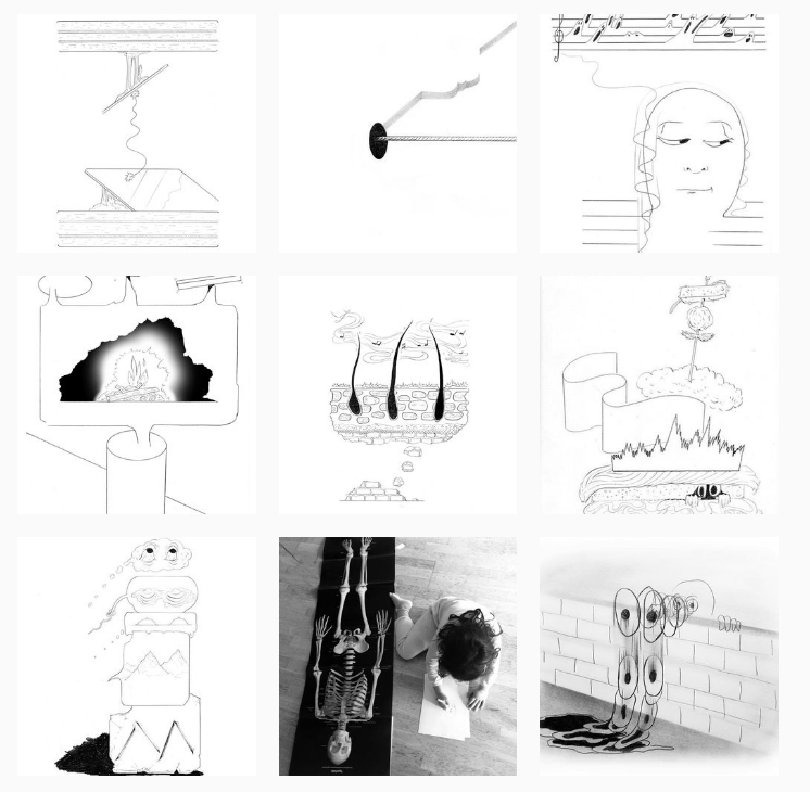
Momo Gordon lives in Portland and makes sequential fine art. With their consistent use of narrative and panels, their style is a well-balanced hybrid between fine art and comics. I interviewed Momo in November 2020.
Hey Momo! How would you describe your practice and style to someone who has never seen your work?
Momo: I make drawings and comics using handmade paper and graphite. I call my work sequential fine art, which is a term that I made up for myself. My style is heavily influenced by comics; sometimes there are panels or barriers within my drawings. They’re also extremely architecturally influenced, especially by Italian design.
Can you talk a bit about your process?
I start every project by looking at references. I look at artists that inspire me and try to imagine how they would approach things. Oftentimes I’m meditating on a feeling and then I’m anthropomorphizing an object or a space in which something is happening. I usually draft things out in Sketchup, a program that allows me to build spaces and objects. That saves me a lot of time. I definitely have something in mind in terms of page layout before I start drawing. Part of the reason for that is that I use fragile handmade paper. If I’d erase too much, it would create a hole.
Do you have a different approach when you’re working on a standalone drawing versus a comic page?
I think my brain is just structured to see everything as a comic. I never consciously think about adding panels or squares, it just happens naturally. When starting a comic, I’ll usually focus on writing everything first. This way I’m giving myself a prompt to complete. Comics often come with a page limit and printing limits, which changes the structure of the drawings a bit because I have to squeeze everything in. If I want to create space I have to plan it out a bit in advance.
I do try to make every page of a comic a standalone artwork.
Right! Your comic pages feel like they could be standalone drawings, and your drawings feel like they could be taken out of a comic. How do you deal with the hierarchy of lowbrow versus highbrow in terms of profiling your work? Is this division something you like to challenge?
I purposefully call myself a sequential fine artist so I can play both roles, and I never differentiate between these two sides of me; they belong together. Many successful artists are doing comics as well as contemporary highbrow stuff.
Making comics takes so much time and energy and yet they are not really profitable. A lot of artists will tell you that they’re doing what they’re doing (whether it be design jobs, illustration or fine art) to bring in money so that they can continue making comics.
On the occasion of international book day, you shared a bunch of your favourite small press and comics. Do you take a lot of inspiration from other artists?
I am inspired by a lot of people. I love instagram because it’s a self-curated stream of inspiration. I think we’re all kind of influenced by each other. It’s definitely more about the energy and the fact that people are doing things, not just the work itself.
Your spaces have such strong personalities that I can’t help but experience them as if they are characters. As if it’s the spaces that are telling the stories. How do you feel about the idea of seeing your oeuvre as a comic in which your spaces are the characters?
I don’t have a fixed style for my characters because I think everyone looks so different. It’s really difficult for me to pin down a human form that I like to draw over and over. I do have an obsession with the idea that our spaces define who we are, not the other way around. Especially during quarantine, our rooms were shaping us. Someone said my works are ‘emotional landscapes’. I became fixated on that idea and started researching hostile architecture. That’s when the spaces I was drawing changed; I suddenly felt that there needed to be a reason for everything. Aesthetics aren’t enough; it can’t just be that it looks good with columns or some weird bed. The elements in my drawings have to connect to the narrative. I think that concept really came forward in the last story that I did, Palazzo Specchio (place of mirrors).
Could you talk about your zines Self driving car’s night off and Coin of the realm?
Coin of the realm is a zine about my instagram anxiety and about how bad I wanted to be a popular artist with lots of followers. The storyline is about me trying to figure out what is going to get me the most likes, what is seen as valuable in our society. In the story I put a checkerboard pattern on everything, and consider if I should draw monstera plants because the general public is really into them. I traverse into these weird spaces and try to sell my soul and of course I end up dead. This was actually the first time I made a comic with this dreamy architecture in it. There is a two-page spread that has a curved amphitheater staircase and a giant checkerboard orb sculpture floating in the space.
There was definitely a taste of architectural desire in my earliest comics, but it had not fully developed at all. In Coin of the realm I realized how much I loved using architecture. So Self driving car’s night off, the comic that followed, was just an excuse to build anything. I built all these ridiculous spaces in Sketchup and then I took a car and flipped it off the buildings.
The architectural drawings really helped me get rid of the tendency to try to make work that was pleasing to other people.
What are your future ambitions or aspirations in the field of comics or sequential fine art? How do you see your practice evolve?
The last two anthologies I did finally had storylines that really felt like me in terms of narrative and architecture. I want to continue pushing myself with comics in order to create better standalone pieces. I want to do more books of course, but like I said before, bookmaking is not profitable enough to sustain myself as an artist.
Lately I’ve been sewing a lot; my partner is a garment maker. I have always wanted to make clothing and to create products, like bags and jackets. More and more comic-influenced work is moving into the gallery, fashion and interior design world. People want to put a print up on the wall in their house and they also want to express themselves in the way they dress. It seems natural for me to put those two together. I see myself trying to make objects that come with a comic, for example.
You can see more of Momo’s work on instagram: www.instagram.com/slippypeach
Maya Strobbe
contributor to the Post-Comics printed matter presentation in Kunstenbibliotheek
Momo Gordon, Death is not an easy energy, I’m transforming and it is painful, 2020.
Momo Gordon, 2020
Momo Gordon, Cliff side home proposal, 2020.
Momo Gordon in collaboration with daag, organic cotton canvas pant with image transfers, 2020.
Mixing jazz references and comics characters, imagery from children’s books or encyclopedic illustrations, the etches of Sipke Huismans (1937) take us into the meanderings of language and imagination into weird but very readable places of the unknown, as K. Schippers puts it: “No obscure abstraction or overexcited paint eruptions, but a world full of people, animals, things and situations, a recognizable one and in which, it seems, you can wander around for a while without a fear for special traps or mines. After all, you’re on familiar, well-known territory.”
Sébastien Conard
contributor to the Post-Comics publication, with thanks to Jan Op de Beeck
Sipke Huismans, Wordt vervolgd (‘To be continued’), ca. 1970, 127 x 106 mm.
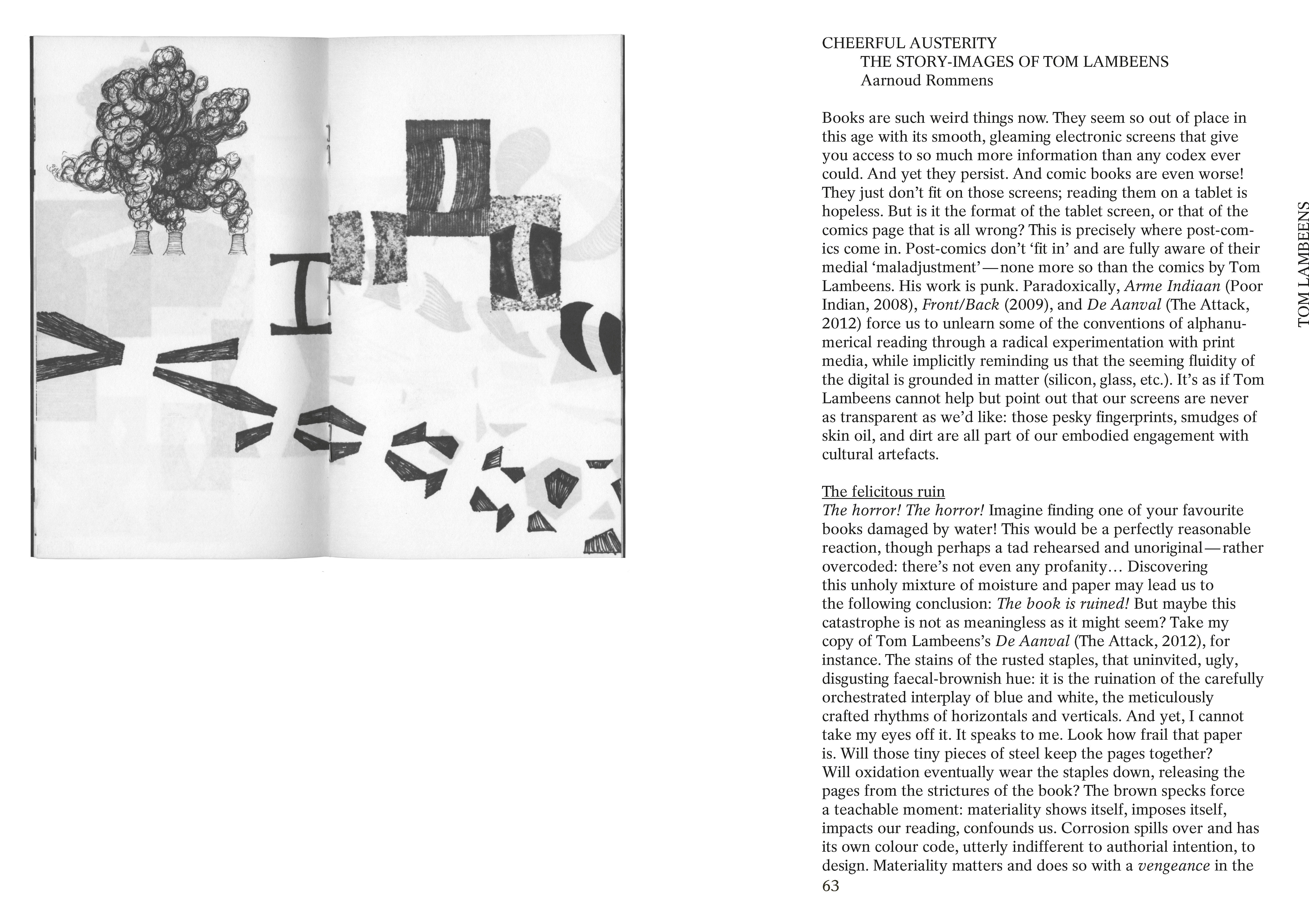
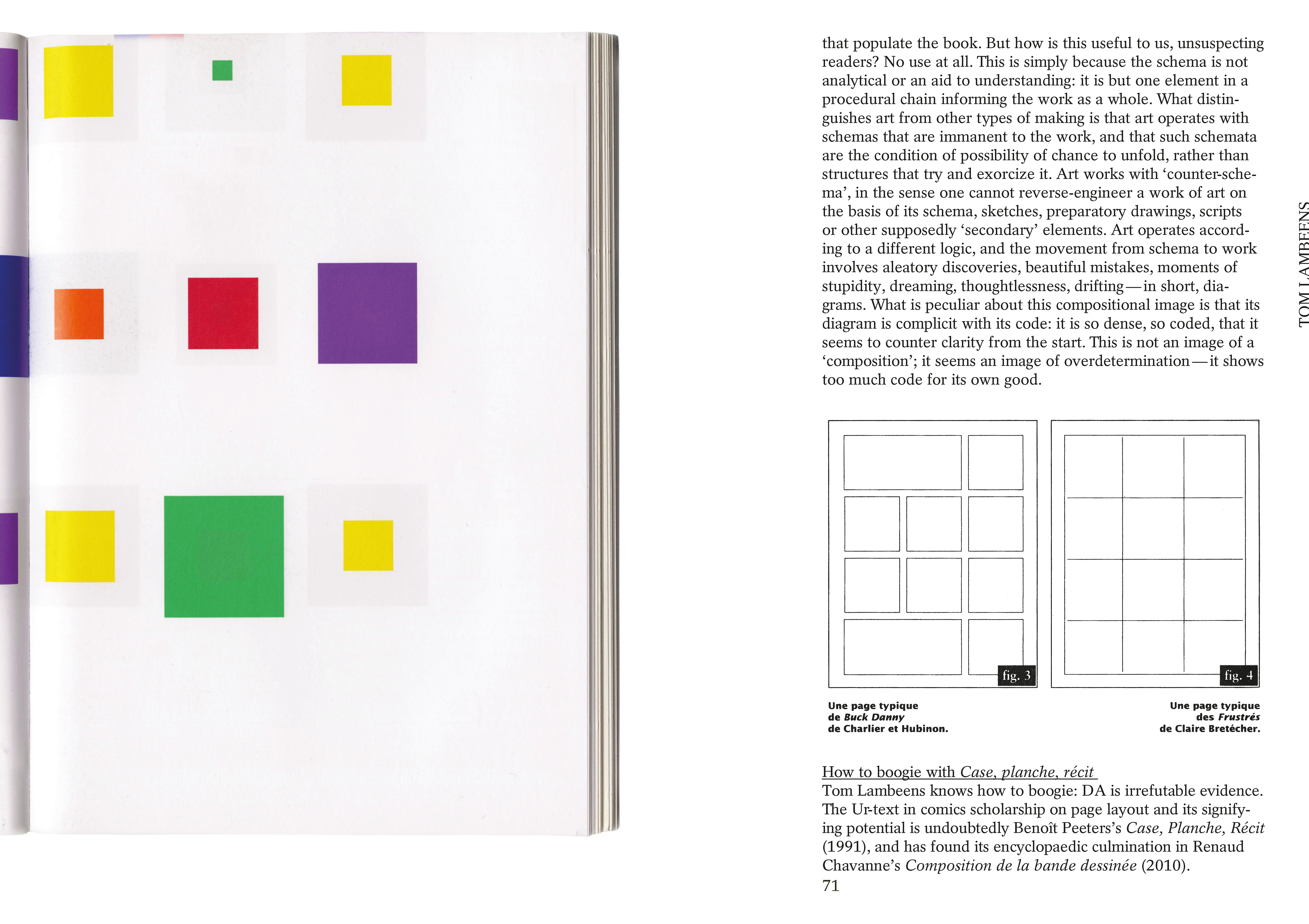
Cheerful austerity, The story-images of Tom Lambeens
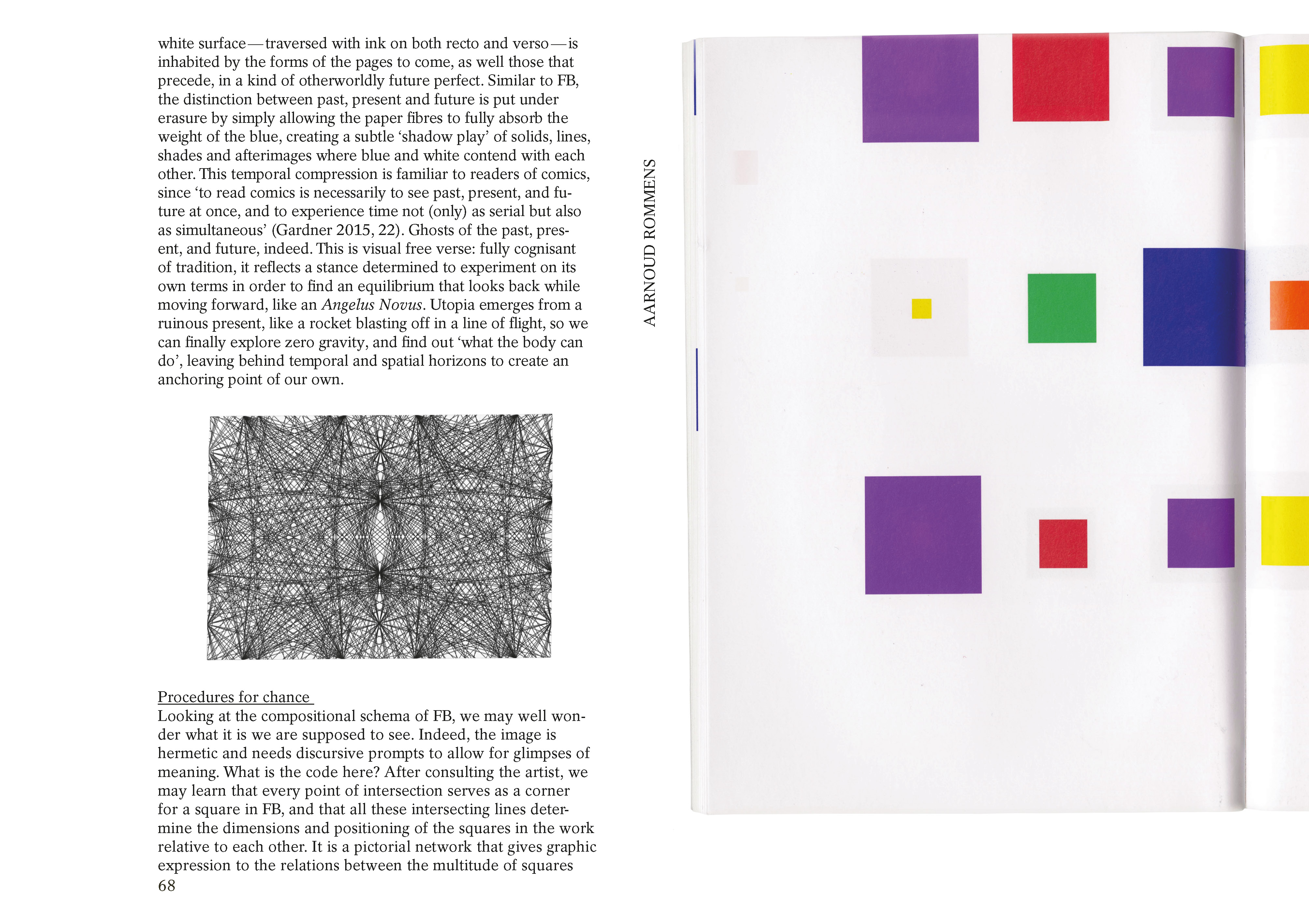
Aarnoud Rommens
Excerpt from the post comics publication, Read full text here.
“It Will All Be Worth it in the End (2013) and Read It Out Loud (2018) by Stefanie Leinhos show every possible black-and-white variation of a single image. Some images are parts of Disney characters. That they are recognizable as Disney characters means that these images operate as a sign. However, the images here simply act as a template for the repetition and variation and do not bear any special meaning — either denotation and connotation — for being parts of Disney characters. Instead, the the reader is invited to examine the relationship between the sign and image/shape. Even when it is not working as a sign, we read the shape/image as a symbol.
(…)
The Goddam Language (2018), published by Editions Matiere, visualizes that semiotic struggle of sign-images. Signs (alphabet letters) are confined in a building. They are tired. It is hard to read them, but we try our best by shedding light and revealing shadows. They are trying to escape the building that signifies the imprisonment of semiotics: one is trying to fly over the window; one is breaking the wall; others are looking at the hole on the floor. At the end of the leporello is a trace of Donald Duck running away from the building. Did he succeed? Even if his body makes it, in this building (our world) his sign lives on.
So far we have seen how Stefanie Leinhos questions the relationship of the signifier and signified, the hierarchy of the original and reproduced, the impossibility of the representation, and the representation of time. Leinhos interrogates the critical issues of visual media, especially of the representation, through the conceptual comics.”
Kim Jooha (2019)
on The Comics Journal online: http://www.tcj.com/stefanie-leinhos-conceptual-comics/
A chamber of echo
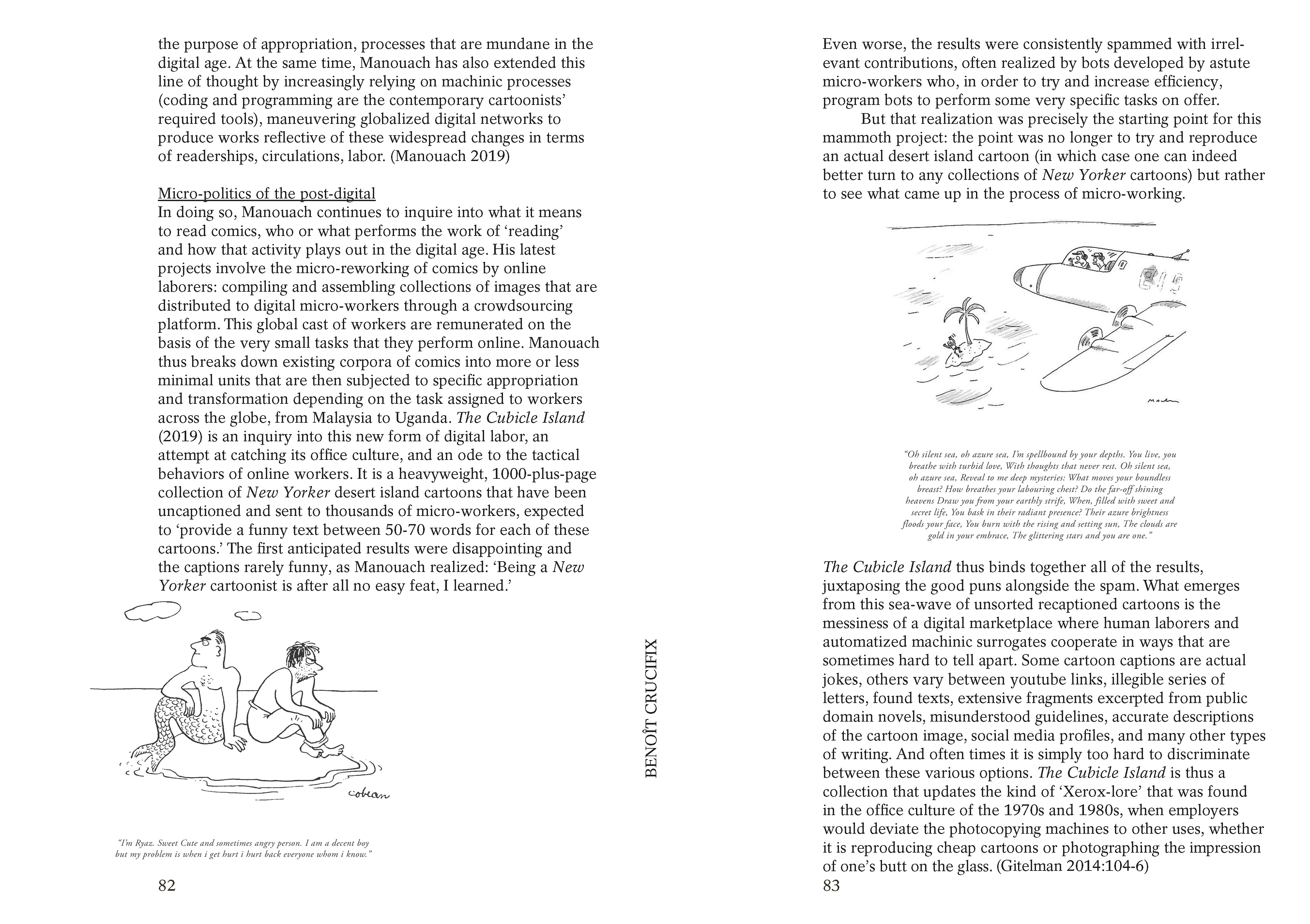
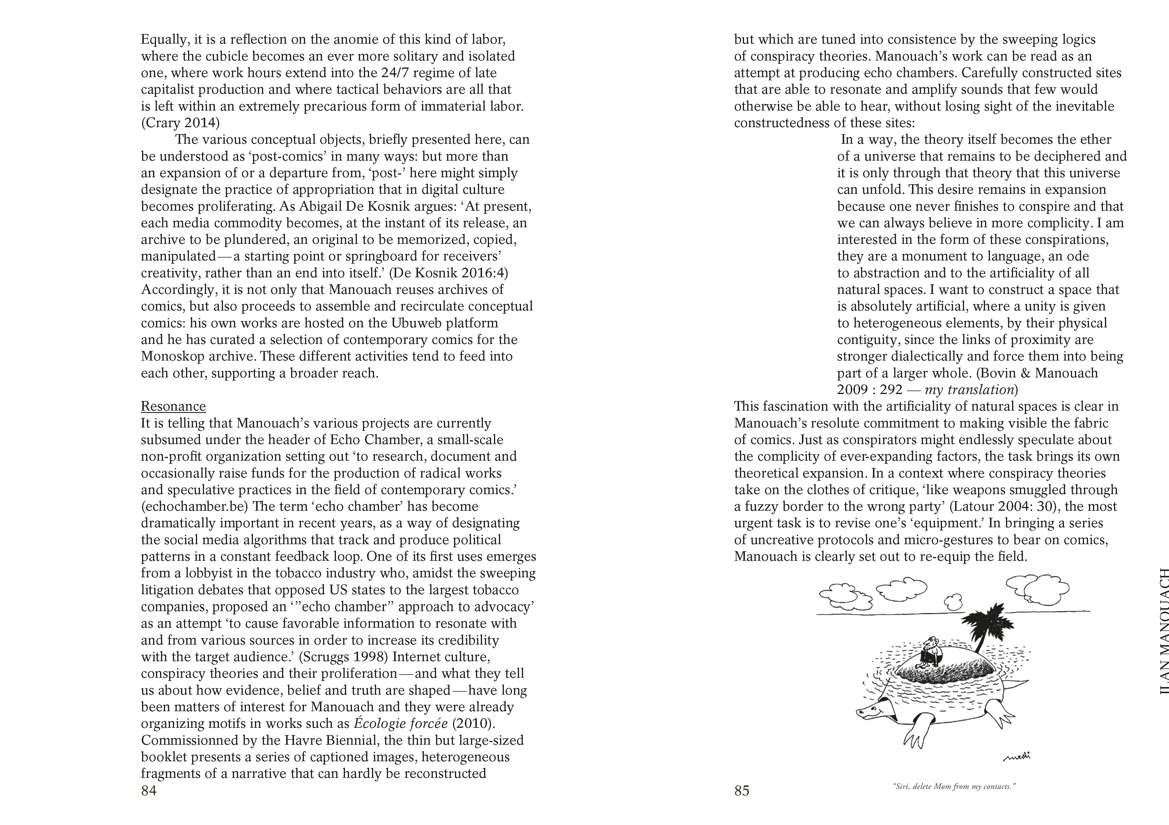
On the post-comics of Ilan Manouach,
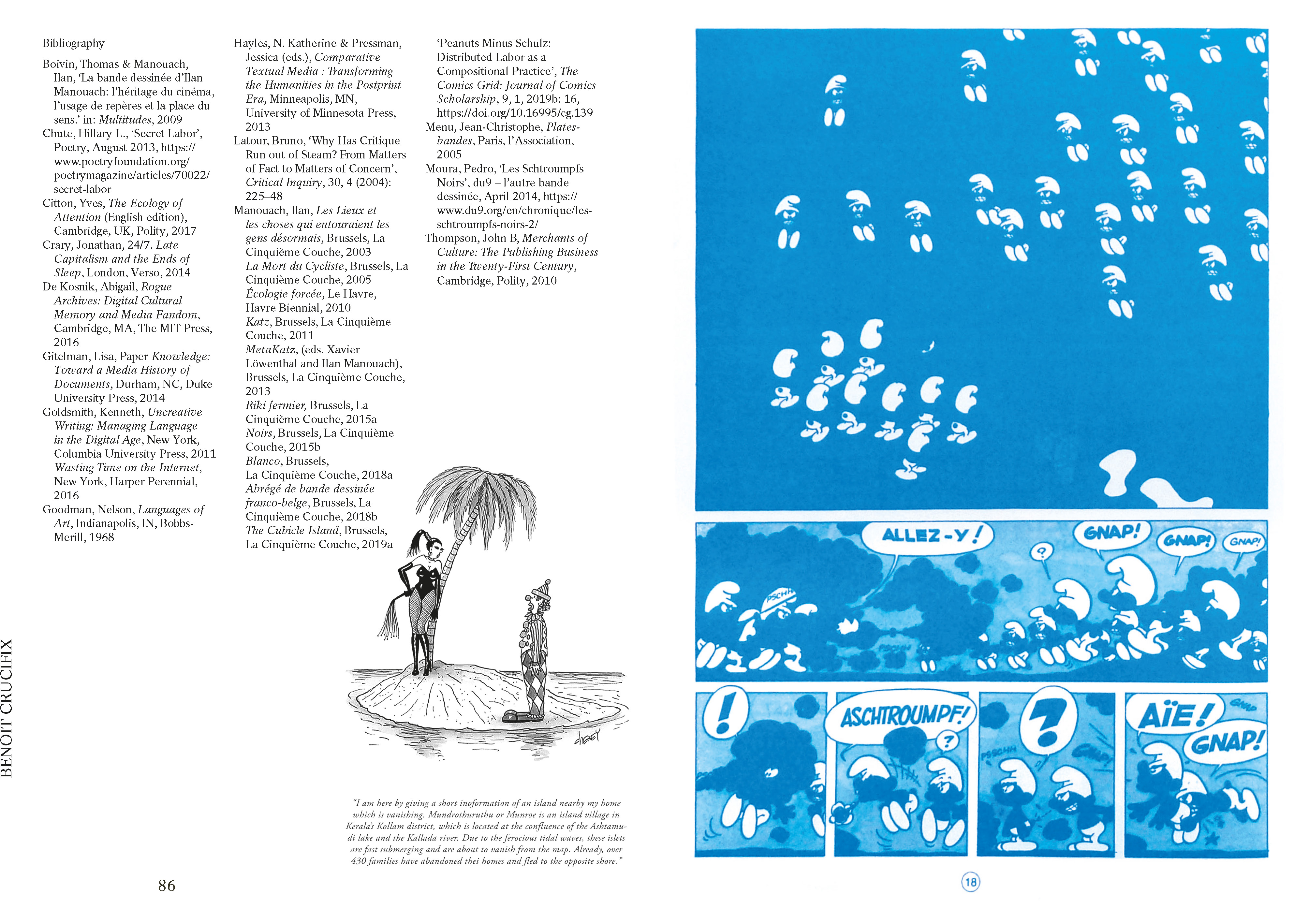
Benoît Crucifix
Excerpt from the post comics publication, Read full text here.
Christian Marclay is a Swiss-American visual artist and composer. Most of his work explores a distinct relationship between sound and the more material visual media such as photography, printed matter, and film. He is also known as one of the initial artists experimenting with turntables in the early seventies.
Much like a form of physical collage, he has been using samples and records as interactive instruments often treating them to create errors, skips, and distorted loops. In his films, as well as his work with visual media he is a compiler of image fragments often using strategies related to typologies but also to loose associations and collective memory. In Marclay’s own words: ‘The restructured presentation is the commentary.’ (1)
In the context of Post-Comics, Marclay’s project and publication To Be Continued (2) (2016) is a musical score for guitar, woodwinds, double bass, and percussion. Unlike a traditional score, the publication is staged by existing comic book cutouts of musicians and listeners. These personages and their instruments are visually rearranged to interact with each other, and to be interpreted, page by page, by an orchestra. The graphical score is designed to be performed with the duration of 30 seconds per page. Another rule is: ‘you can imitate an instrument if it is closely related to your own.’ Analogous to what we see, the book is a script for a sound collage, and through its imagery presents us with humorous juxtapositions and twists – ones that the musicians have to improvise on. The subject of the publication, which is performed by a bunch of comic book characters, remains music and sound, but can nevertheless be enjoyed as a comic in its own right.
In Marclay’s work there is an analogy between the sampling and cutting up of sound and the clipping and montaging of other media such as comics. The artist represented the US at the Venice Biennale in 2011, and was awarded the Golden Lion for ‘The Clock’. (3)
Kasper Andreasen
artist, author, lecturer
1 http://www.jca-online.com/marclay.html
2 https://www.kunstraum-innsbruck.at/publikationen/archiv/christian_marclay
3 https://www.youtube.com/watch?v=C0ZLrW2dmAw
Christian Marclay, cover image TO BE CONTINUED, 2016, published by Klangspuren Schwaz, 48 pages, 22,5 x 30 cm.
The work of Sevilla-based illustrator Marìa Medem attracted my attention primarily through the use of the recognizable colors and texture of riso print. The chromatic colours are just the finishing top of a complex multi-layered expression. Although the oeuvre of this illustrator is not large (yet), there is a recognisable style of psychological narratives moving in between dream, fantasy and reality.
Échos is a mute comic with ‘water’ as main protagonist. But here, the water doesn’t react as we would expect. It is a formless character that expresses itself using the whole spectrum of cold and warm emotions and speaking a language of reflections and tears. Choosing to make the story mute is also choosing to give more space for interpretation to the reader. As a result, the book takes you on an exploration of thoughts, balancing in between recognition and alienation.
She plays with rhythm as in a film and compensates for the lack of moving image by introducing different storylines. Now and then, a red line drawing zooms in on a specific detail in the scenery and contrasts with the more traditional use of horizontal and vertical reading lines. In a corner, a small drawing of a metronome defines the tempo of events and of the reader. It is surprising to see these techniques so frequently used and combined in a comic.
In this story Medem tackles the laws of nature, not only with water, but also with gravity and time. All these elements follow the new rules she set up for them in her own self-made universe while exploring the boundaries of a 2D-comic book.
Other publications by Medem can be found here, as well as online works like Hovvdy – Mr. Lee (music clip) or the illustrations she made for the poem ‘The Palace’ by Kaveh Akbar.
Suzy Castermans
coordinator Kunstenbibliotheek
Abrasive melancholy, On Benjamin Monti
Jean-Charles Andrieu de Levis
Excerpt from the post comics publication, Read full text here.
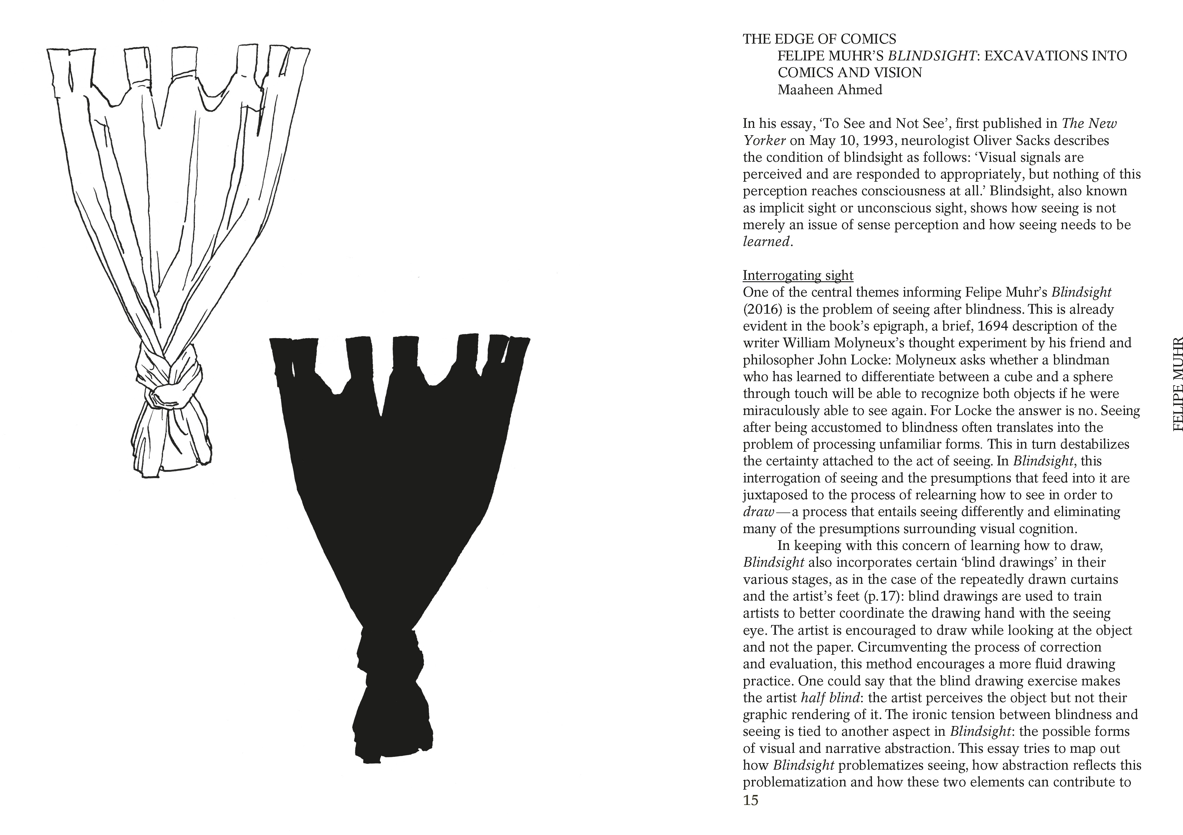
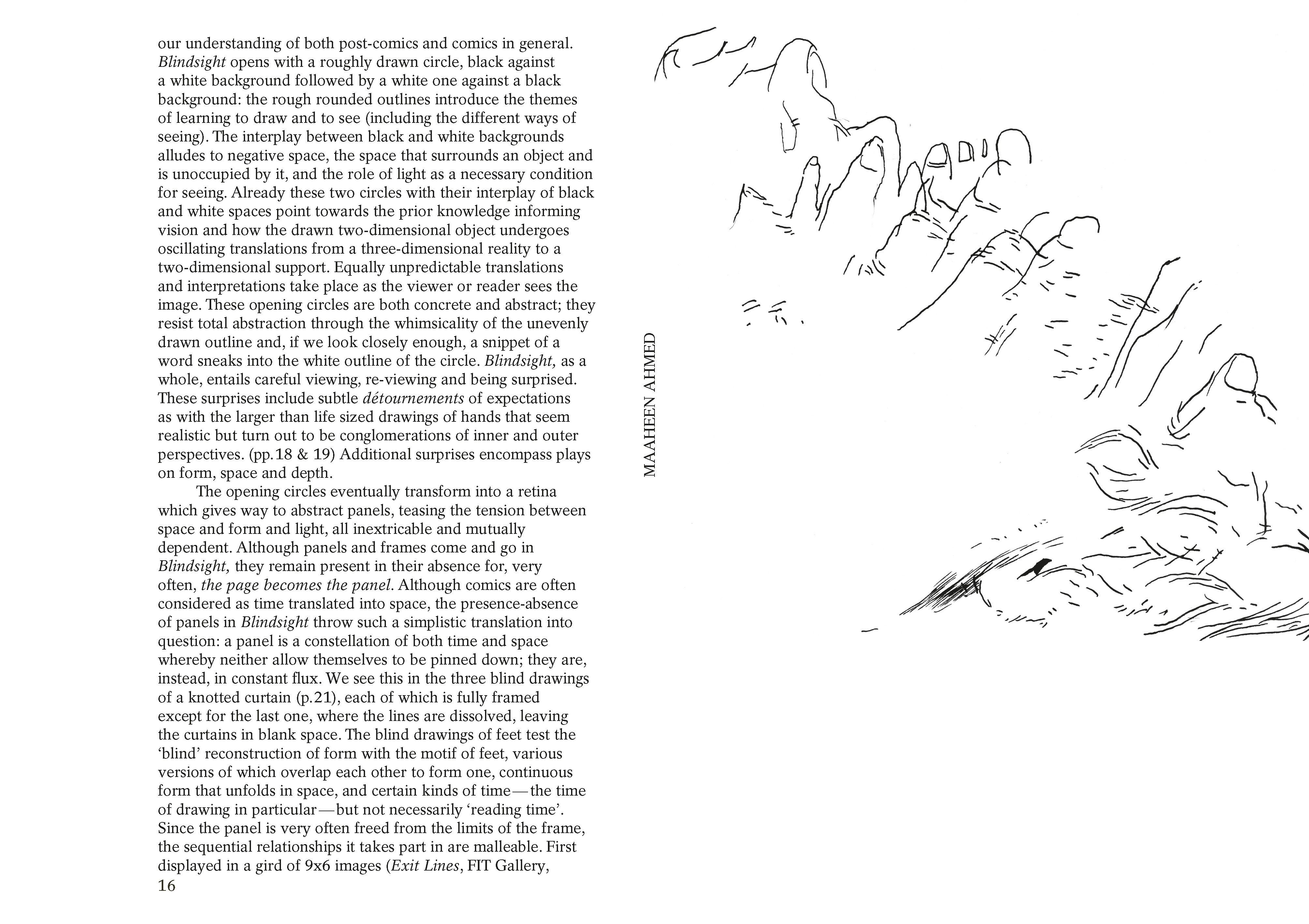
The edge of comics, Felipe Muhr’s Blindsight: excavations into comics and vision
Maaheen Ahmed
Excerpt from the post comics publication, Read full text here.
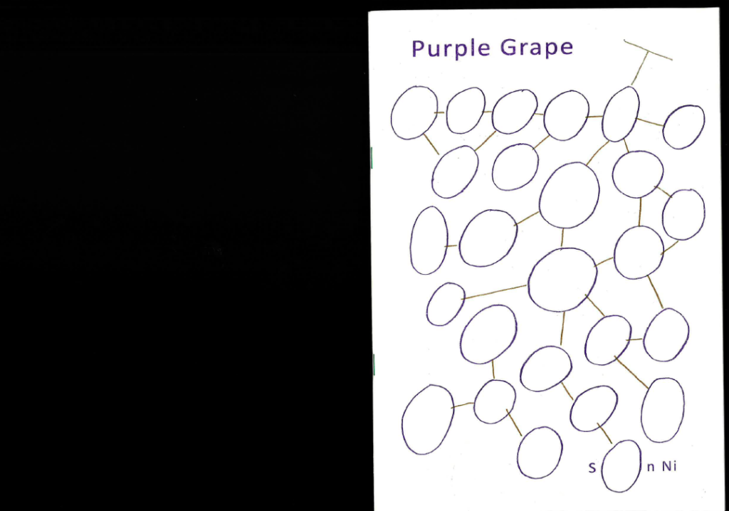
Dear Purple Grape,
Lying there as fresh table fruit during the Grafixx pop-up book shop, you shone and stood out. I handpicked and carefully examined you all around. Once home, I consumed the bunch, plucked it bald one by one, but didn’t immediately grasp you as a whole. If you are a bunch of grapes, how would you describe the connection? Grapes grow in clusters of 15 to 300, but are nevertheless consumed one by one and each fruitling has its own flavor. Raw grapes are 81% water, 18% carbohydrates and 1% protein. This type of berry can be crimson, black, dark blue, yellow, green, orange, pink or purple.
You exist 320 times and grow in clusters of 28 pages. You are 14,3% silk paper and 85,7% plain paper containing 11% purple and 1% yellow. You exist as a book and you house the purple grape. Purple jumps from one page to the other, sometimes skipping one, or disappearing in the other, as a body or just as the color grape. Purple gets kicked out, right through the left nose wing. Or it’s squeezed, between butt and heels, thumb and index finger, page 7 and 10, outer and inner body. Staple bound, otherwise you would drip apart. You are like a glass of grape juice: see-through, sweet and sticky once open.
By the end of the reading, Purple fell asleep as a fluid sheet between you and me.
Liene Aerts
coordinator of the Post-Comics exhibitions
As a good night’s read, also check the text by Jordan Spencer on Son Ni’s body of work and in particular her latest book The Well-Tempered Us. An excerpt: “Son Ni’s work, which began as drawing and moved into comics, now falls somewhere between, free from narrative but tied to the timeline, accumulating meaning through repetition and transformation rather than through dialogue or conventional visual progression. (…) The Well-Tempered Us, tells the story of drawing, how a line on the edge of a comic panel can easily be bent into the curve of a soft body. The drawings have been arranged rhythmically across the pages, sometimes three or four at a time, positioned everywhere from the far corners of the book to the gutter. The page itself is a plane of interaction. Occasionally the bodies are seen in jubilant motion, stretching, and bouncing across curvy landscapes, running away toward an unseen horizon, or slipping into a massive cluster of grapes, where the difference between the curve of a stomach and the curve of a fruit disappears. More often though, the bodies are constrained and pushed into uncomfortable spaces, both architectural and abstract, like blueprints for rooms that could never be built. At some points the figures are able to bend lines to find better accommodations, while at others they seem resigned to their fate, accepting of their cramped quarters. These boundaries never dominate the space on the page. Their limited space is not the result of limited territory. There is always space to expand but the dimensions of confinement have been chosen.”
Jordan Spencer (2020)
on The Brooklyn Rail online:
https://brooklynrail.org/2020/12/art_books/Son-Nis-The-Well-Tempered-Us
It was a long afternoon and I let myself down into the world wide web. So down I went. I reached the acacio-ortas.tumblr in mid-afternoon. I entered the underground cave-like dwelling where men, monks, monsters and dogs were all connected to each other through earpieces connections, breastplate tablets, goggles, joy-sticks and other equipment. Some out of fetishism. Others out of desperation. It comes to my mind that perhaps these creatures has never seen the source of daylight directly. I mean the sun. Of things and of themselves, they only knew their own avatars projected on the surface of the cave walls by a computer screen lit up behind them. Of sound, they knew only the echoes of an error message. And yet, they looked like us…
I stared at this after-life vision on the other side of the looking screen, as if in a mirror. I mean from a first person perspective*.
I pointed my arrow at this collection of avatars* supposedly made from deities, to blood, and from blood to pixels. Best Friends Forever, Monkster, Emotional Vampires, Pizza Delivery Roller Skater Hackers, Business Dogs, Jumping Joy Sticks, Harp Dealers and Queer Feminist Traders constituted the horrific members of this deviant* society of transformation fetishists*. Fascinated by the grotesque mirror they handed me, I went down. Or across.
IRL :
* The first-person perspective in video games defines avatars-based games in which the player sees and experiences the action through the eyes of his or her avatar.
* In Hinduism, an avatar is the incarnation of a deity in the form of animals, humans, objects, etc. In the computer science, it refers to the digital incarnation of an individual in the virtual world.
* DeviantArt (https://www.deviantart.com/) is an online community for artists and art lovers, where members share their passion for art as well as their own creations. The members of this community are called the “deviants” and their creations “deviations”.
* Transformation fetishists or TF is an online community whose members share a sexual or non-sexual fascination for transformation through images and texts that generally describe humans transforming into another form (other humans, animals, objects, etc.).
URL :
https://www.instagram.com/acacio_ortas/
https://humourzone.bigcartel.com/
https://acacio-ortas.tumblr.com/
Maud Gourdon
contributor to the BOEKS 04 A Flower is Speaking to a Dog presentation
“Francesc Ruiz makes art in an expanded comic-book format that exploits the radical potential of cheap printed matter – and words and pictures – to forge stories and to survey the construction of gay identity and the contemporary city. Ruiz advocates the work of American comic-book artist and theorist Scott McCloud as a manifesto for the future of comics. McCloud treats comics as a revolutionary device whose distributive landscape circumvents the trivializing effect and proprietary clout of mainstream media.”
Max Andrews (2012)
on Frieze online: https://www.frieze.com/article/focus-francesc-ruiz-0
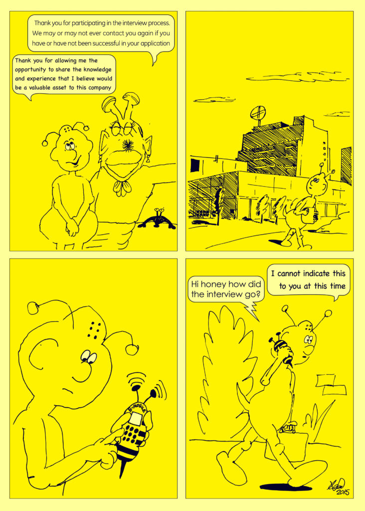
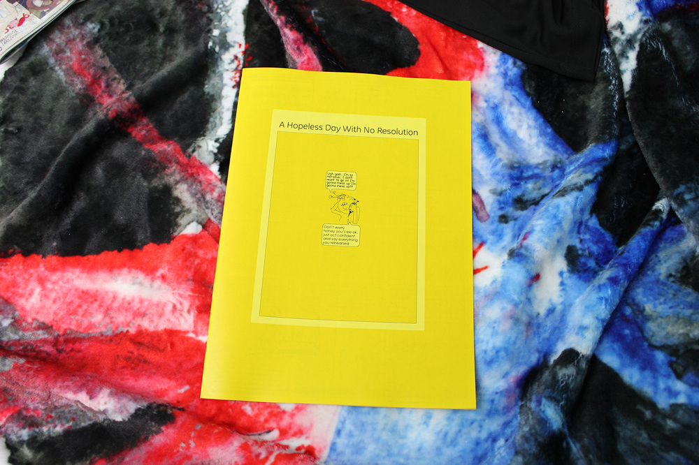
A comic book as an exhibition text:
“Bumblebee didn’t have an exhibition text, instead, Sadler had created a short, yellow comic book, called A Hopeless Day With No Resolution. The comic featured a bee applying for a job. All the characters were insect-like, but had human behavior, like humanoids in cartoons. The protagonist bee walks into the company and is asked to wait “an undisclosed amount of time” before he is called in to start the interview. When finally inside, he has to talk to a secretary, who shows no emotion, and a speakerphone, which is called a spider-phone in the comic and looks like it’s alive. Both parties talk in extreme jargon, making it almost unclear what they are talking about and giving it an excessive corporate feel. The questions posed by the company’s representatives are very hard, but the bee seems to ace every one of them, although he can’t tell for himself if he’s doing good or not. Nearing the end of the interview, he’s presented with really bad working conditions and no constructive vision for the future, simply undergoing and accepting them to maintain his candidacy in a positive atmosphere. The last thing they said to him is that they “may or may not ever contact him in the future”. He thanks them and emphasizes one last time what a valuable asset he could be for the company. When going home he calls his wife saying he can’t “indicate” how the interview went. This comic was to give a general feel for the exhibition.
The comic addresses multiple themes through its writing, drawings and design and was thereby the perfect guidebook for the show. First of all, Leon Sadler, next to being a full time artist, also has a full time job as a designer of product catalogues for a scientific equipment distribution company. It’s no surprise that he touches on the subject of the business world, since he himself is a busy bee and confronted with the often strangling nature of corporate society. Due to the political and social atmosphere in England, it is hard to fully pursue a career as an artist and feel society’s pressure of having to work full time, as opposed to enrolling in a laid out pattern, applying for jobs until you are one of the worker bees. The bee in the comic being nervous and submissively surrendering himself to the awful conditions of the company, reflects the powerless position of the modern day, middle class laborer. In fact, the text used for the comic is largely based on Sadler’s application form that he was to complete for his current job.
Leon Sadler has also been a well-known entity in the independent publishing world, creating small comics, graphic novels and artist books, and self-publishing the works of others. Almost all of his books are created at a fast pace, with a lot of energy, usually based on doodles, low grade cartoon forms and icons, the kind that appear on a bootleg euro store toy packaging, white van clipart graphics and commercial forms that have bypassed quality controls. He takes inspiration from the creative expressions made by teenagers, art made in that super heightened emotional state, halfway between child and young adult, engulfed with so much conflict. Very importantly, humour is present everywhere, even if it’s just the goofy expression of a snail, to create nuance and a certain airiness to a sometimes serious topic. Sadler has taken a step beyond the format of the booklet and has been translating his drawings into larger, autonomous works and sculptures, coupled with a ceramics class he started taking two years ago, which paved the way for Bumblebee. At the show were the results of his two-year investigation in ceramics, creating works soaked with his own particular style elements, very much focusing on presentation beyond the 2-dimensional booklet, seen in the pornographic like manner of hanging his ceramics, which involved a number of parts to cover up the screws, which were very meticulously placed on each piece. The ceramic slabs represent gargoyles, meant to scare away “evil”, and also bring to mind the cheeky faces of the ‘Troublesome Trucks’, the misbehaving worker drones from ‘Thomas the Tank Engine’, leering from the walls. These were shown next to some of his sketches and one very large drawing made with black graffiti ink on a yellow plexi board, referring to the ‘warning’ and ‘danger’ aesthetic, just like the colors of a bee, radiating with energy as you combine what you see, a couple of up to no good punks in a car, driving through nature, with the swiftness the piece was drawn, like a graffiti gangster spraying at night.
In general, Leon’s work portrays a giddy smile, free and boundless, but menacing too. It contains the naiveté of a child and uses a colorful scheme, but at the same time poses some sort of eery threat. When asked if Leon wanted to add something to the text, he said: “The overall message for the show is “Go away, I’m busy!” ;oD”.”
Exhibition text written by Benny Van den Meulengracht-Vrancx on the occasion of Leomi Sadler’s show Bumblebee at Hole of The Fox, Antwerp, 2015.
Installation image Bumblebee exhibition at Hole of the Fox, Antwerp, 2015.
Leomi Sadler, Turbo Diesel, 2015.
Zin Taylor is a Canadian-born artist who is fascinated by the foundations and relationship between language and form. He delves into the process of how ideas or thoughts would look like if they were objects or forms. Yes, how would thinking look like if it was made visual? As a result he is creating an abstract language of his own. Ideas take on formal qualities, representing connection between object and concept. The horizontal movement of words produces narrative and the vertical gestures form the letters. The dot stretching to become a stripe, the stripe bending into a zigzag. His works often function as speculation on the organic origin of a form and thought. He uses a diverse range of mediums to play with these ideas – from installations, drawings, animation, writing and other modes of visual storytelling. But his main fascination is the shape, materiality and gesture of a subject and the narration that arises from that. In a way he is like a narrator of forms. He opens up a conversation between and with items to which no words are assigned. He allows us to look at what an object actually has to say when it is allowed to express something beyond its function and materiality.
Ieva Lība Ratniece
part of the Post-Comics exhibition

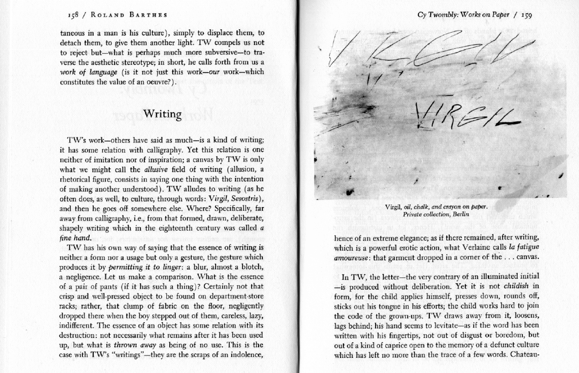

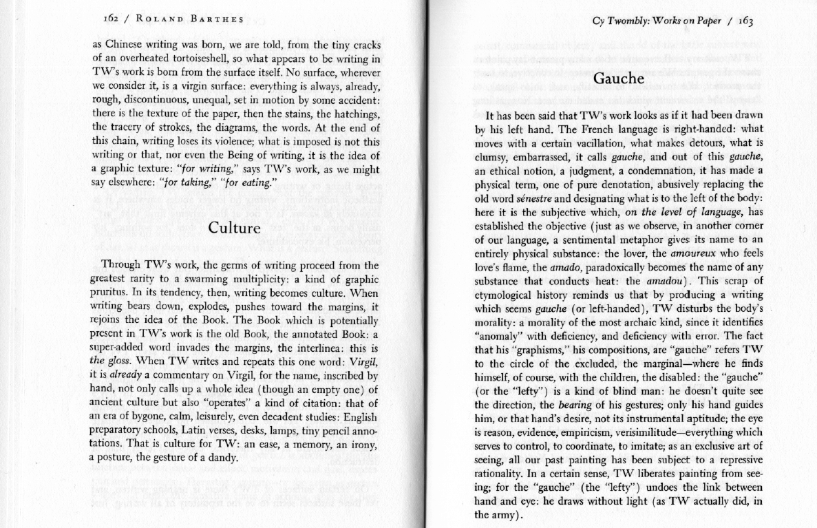

Cy Twombly: Works on Paper, 1979
Roland Barthes
With thanks to Natasja Mabesoone. Read full text here.
François Van Damme is a Belgian graphic artist, who studied Comics and Illustration at Saint-Lucas Ghent and Ecole Supérieure des Arts Décoratifs in Strasbourg. Van Damme started as an all-round graphic artist and graphic designer, e.g. lay-outing for newspaper De Morgen and the rather eclectic Flemish comics magazine Plots (2007-2010) to which he also actively contributed as a drawer (on scenarios by Peter Moerenhout amongst others). Over the years, his complex and variated drawing style evolved toward greater abstraction, focusing on typographical and pictographical elements in intricated arrangements. He extrapolates typical gestures, shapes and motifs common to comics, graphic design and illustration to explorative and often mathematically looking compositions. One of his most evocative series in this respect reinterprets early modern paintings by the Dutch Old Masters (like Vermeer) by translating the figurative tableaux to black and white shading and hatching. The results form an ongoing series of cosmic-like semi-abstract graphic rendering of the original paintings, highlighting their intricate compositional aspects while fading the iconographical content. Van Damme has been consciously avoiding the practice of exhibiting his work in galleries while publishing online and in the context of specific subcultural scenes. To this date one monography concerning his work has been published: Autolubrifiant, edited and published by typographer Lennart Van den Bossche in 2016.
Sébastien Conard
contributor to the Post-Comics publication
Swahili, “Met schaar en pritt”, 2020
Robert Varlez is a marginal author who worked in the 1970s. He disappeared from the comics production before being rediscovered in recent years thanks to the intensive promotion of the cartoonist LL de Mars and the editorial work of Alexandre Balcaen with The Hoochie Coochie editions, then the Adverse editions. Although his work became famous only recently, this deficiency should not mask the extreme modernity of his work, which has lost none of its avant-garde. From his first experimental achievements on, some of which were published in the literature review Minuit, Robert Varlez established the foundations of a singular style which he continued to develop. His creations were inspired by the famous chronophotographic contact sheets produced by Eadweard Muybridge at the end of the 19th century. To analyze the locomotion of living beings, Muybridge photographed various actions by recording them over very short periods of time, so that they could be studied in the smallest anatomical details. Robert Varlez takes up this notion of photographic division of movement to which he associates a dynamic of figurative and plastic decompositions of the image. In doing so, he reproduces the pages published by Muybridge and intervenes on them by the appearance and deployment of materials and / or figures (photomontages) in the image. The bodies move, the contrasts of white and black circulate in the page and attract the sequence towards a contemplation of the figurative variations operated by these graphic fluctuations. Intervening in this way, Varlez no longer recounts a movement so much as he stages the plastic manipulations of this movement. He thus offers dreamlike and surrealist sequences where the idea of narration is abrogated in favor of the concept of visual poetry.
The organization of a comic strip in structured boxes makes it possible to link temporally disjointed actions: the reader can imagine or project what may have taken place between two boxes. But several stases that are too close together stretch the notion of temporality at the risk of repealing it: the action no longer moves forward, the drawings become too repetitive and give the impression of standing still. Relying on this phenomenon specific to Muybridge’s boards, Robert Varlez sets up in his sequences a tension between a form of narrative disappointment (the action takes place too slowly and presents little interest in terms of the scenario) and plastic revival ( forms and masses appear, and then amend the images and divert the original movement of the image) which triggers new narrative stimuli (the action takes place on a new level). Thus, no twists and turns with Robert Varlez, or rather: twists and turns proceed essentially from visual distortions. Through this deviation from the scriptwriting efficiency of the sequence and the many graphic distortions, Varlez’s plates question the very notion of reading: the readers must switch to a contemplative mode in order to appreciate the mystery that moves them.
Jean-Charles Andrieu de Levis
contributor to the Post-Comics publication